Labels are often an after-thought for many users – we don’t like them, but are necessary. Using some simple steps we can create better labels which are easier to interpret for the users of the dashboard.
[This blogpost is part of a series tips tricks, as being presented at VizIt Berlin 2023]
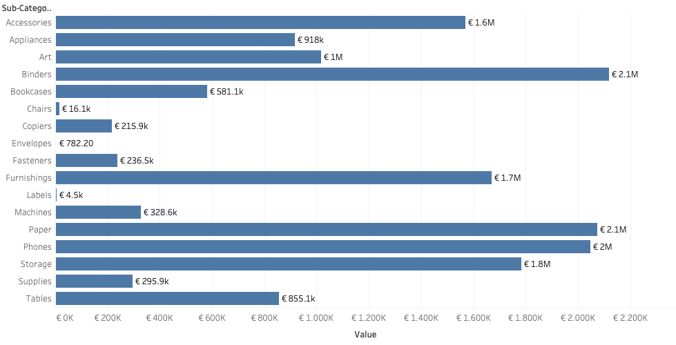
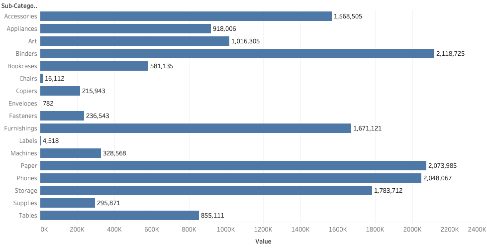
I have to the well-known Superstore dataset, and created an overview of the sub-categories and its respective sales.
A basic setup which is very often used, but let’s improve this with some easy tricks – in this case the labeling.
Format as Currency
First: if you are talking about money, show it is money.
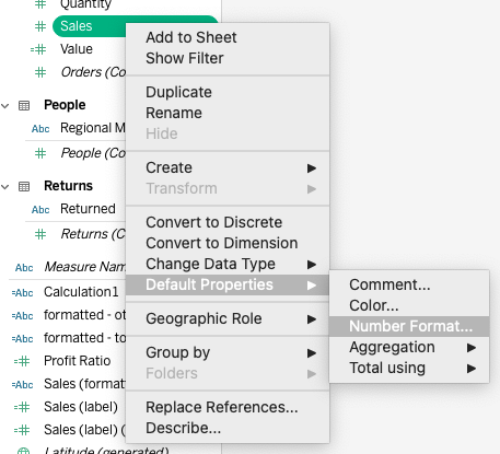
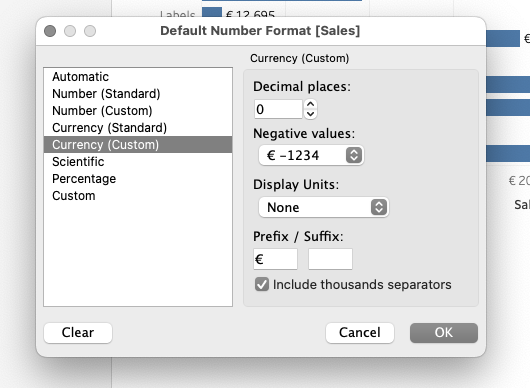
Changing the default format of the field to ‘currency’ in the right locale is easy. I live in Europe, so I choose the Euro:s:
But in this view you have got a big difference between the sub-categories: some are over 2 million euro, other less than a thousand euros. Tableau unfortunately doesn’t offer a way to dynamically change between display units: it’s either thousands or millions, but neither work well.
Stumbling by a solution in a WhatsApp group…
Some time ago I followed a discussion in a Whatsapp group on Tableau. This group is a lot of gossip, but often really interesting questions – and answers – show up related to Tableau.
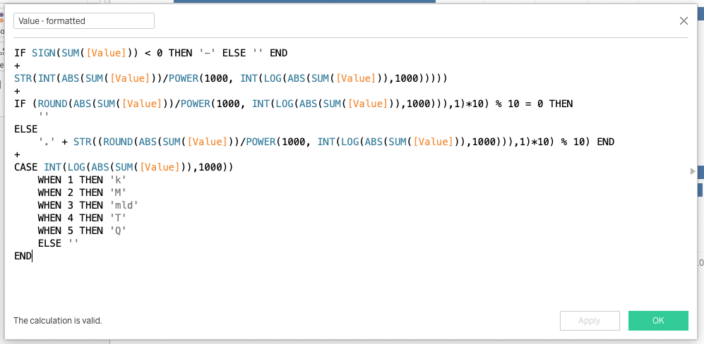
A wonderful calculation was shared which dynamically shows the right display units, based on the value.
It returns a text-value – but that is no problem because I only want to use it on the label, and not on the axis.
Changing the calculation to my needs, and putting it into the vizualisation
I made some small changes to make it better suitable to my own locale, like formatting the negative values and millions/billions.
The result
When I drag this new field to the label, the bar-chart labels show more human readable values! An easy solution, which can be used in many dashboards.