The Top 2000 of Radio 2 (a populair Dutch radio station) has been broadcast for the 25th time – and traditionally I am trying to turn this into a ‘different’ interactive data visualization…
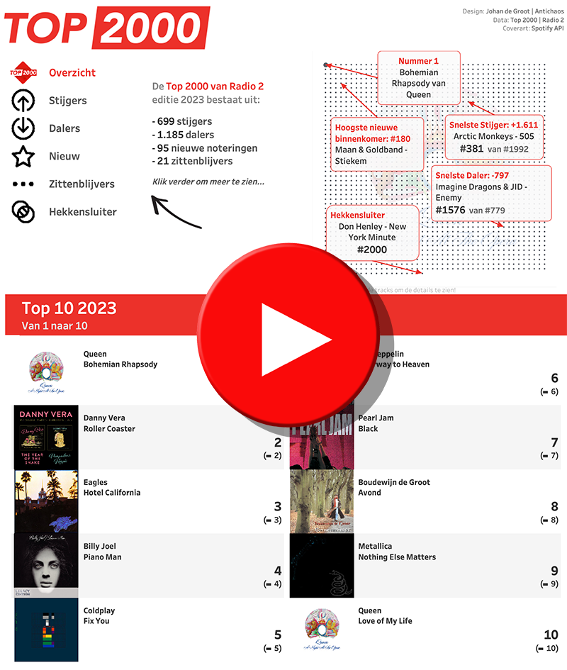
Who came in highest? What were the strongest risers compared to last year – and which were the biggest fallers?
Who was number 1 again? (yes, Bohemian Rhapsody again…) And my favorite: which songs stayed where they were?
Tableau & Spotify API / Spotipy
Find out in this visualization, created using Tableau. For this list, I retrieved the album covers of all songs via the Spotify API (where available…). Using a Python script I retrieved the track information of 4515 songs, including the URLs of the associated albums.
Spotify also offers very interesting audio information about each track, such as the degree of acoustic, spoken text and danceability, but the results were often questionable. But I will definitely do something with that.
If you want to play with Spotify data yourself, I can recommend the Spotipy module for Python.
Tableau Image Role
One of the technical ‘building blocks’ of this Tableau visualization is the relatively new ‘image role’ function. This allows you to easily add images and photos to a dashboard using a URL from your data source. This works well – but for performance reasons you should note that only a limited number of images/photos can be loaded at the same time. Unfortunately, the entire Top 2000 as cover art does not work 😉
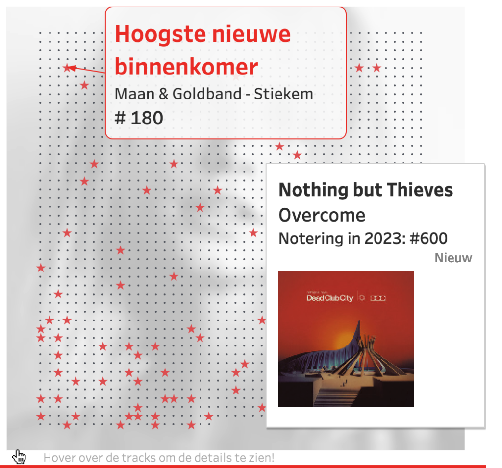
What can be done well is the Imagerol in a tooltip, because only one image needs to be loaded per data point:
More Visualisations
If you’re still curious about other ways of visualizing this list, take a look at the previous versions… (warning: they don’t get any better further back in time…)
And if you have any ideas about visualizations of the Top 2000, or any dataset, please let us know.