[part of the ‘Datafam London 2024 series]
On DataFam 2024 in London I gave a presentation / workshop on deep cleaning dashboards.
Why cleaning dashboards?
- Make it look better ▶ Users want to use it
- Less clutter on your dashboard ▶ Less clutter in your brain
- Making your dashboard more actionable ▶ Focusing on what’s important.
Dashboard cleaning is about: Removing, adding , re-arranging, and replacing stuff. In Tableau, it’s about: Table calculations, extra sheets, changing images, talking to users, being critical to yourself, … Is hard work – and a lot of fun!
It is hard to fix a complete dashboard in half an hour (the length of the workshop), so I gave some tips & hints – in multiple blog post I will try to explain these a bit more.
Let’s start scrubbing!
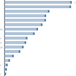
Barcharts
If we view this basic bar chart we can see lots of noise.
Of course, the bar-chart is usable, but by cleaning it, it can be made much more efficient. Follow along by clicking on the ‘next’ button.
The basic cleaning steps
- Start with removing the ugly ‘field label for rows’.
Most of the time it should be clear what’s on this – or it’s even in the title. - Next part of the cleaning is sorting. Sort the chart by value, so it’s immediately clear which sub-categories are sold best, and which ones worst.
- But if we want to know the value of the largest category, we need to look all the way down to the axis.
It’s much cleaner if we put the label next to the bar. - And do we need all labels? If we just need a trend of the values we might give the user hints, and store the rest of the labels into the cupboard – or in Tableau terms: the tooltip!
By choosing “Label” – Min/max only the largest and smallest value remain
I am a minimalist on this chart today, so I even remove the minimal value. - Also put some emphasis on the headers labels. Try to avoid using black – text in grayscale is often better readable
- Remove the gridlines – they are not as useful. Also remove the standard borders (row/column)
- And when you are looking at borders and lines: Tableau always adds gridlines and borders, but the zero baseline is not very clear. Emphasize the Zero line.
- Slide every header to the left. For users it is easier to read left–aligned headers.
- Now the bar itself. You might want to resize the thickness of the bar. As often in cleaning your house – use your own preference.
- More important is the weight of the bar because of the color. The default bright blue color can be distracting from the data, so make it lighter by using a cloth and turn down the opacity. Turn it really down – and use the border function to avoid fading it away.
- How do I direct the focus of our guests – the users – to the data? A fun way is to create a lollypop chart.
I like the lollypop chart – but it has some issues. The main one is accuracy. The nice and sweet circle is hiding the real datapoint, and makes it harder to read.
The “Punctuated Bar Chart” has the advantages of the lollypop chart (focus on the datapoint), without obfuscating it. That is what part 2 is about!