Three easy to implement tips on BANs: the Big Ass Numbers you put on top of your dashboard.
BANs are a common and good way to display important figures. But while they are seemingly easy to implement, often they can be improved to make them more effective.
[part of the ‘Datafam London 2024 – Deepcleaning your dashboard’ series]
Starting point: Superstore dashboard
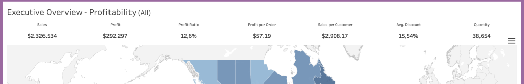
Let’s have a look at the dashboard which is included with every Tableau release, both Desktop, Public and Server. The dashboard contains a wide BAN-bar, with the most important figures. Definitely not bad – but with some easy steps this bar can be improved so it’s more impactful.
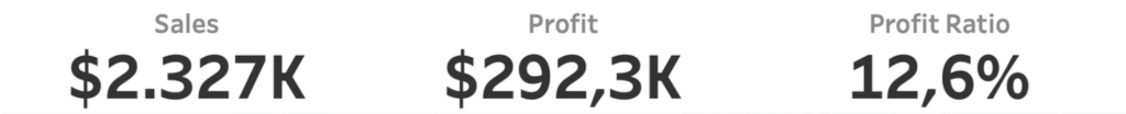
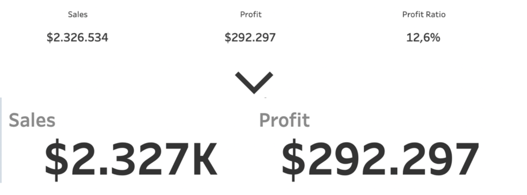
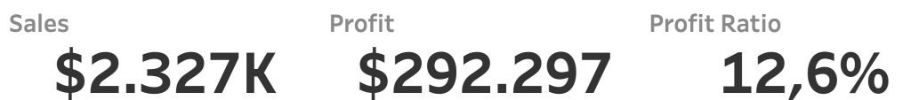
1: Make them big!
If you have BAN – Big Ass Numbers – make sure they are big. Cleaning is not about minimizing stuff, it is about making your environment and tools better. A BAN is meant to be seen!
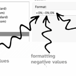
Also, don’t forget to format the BANs in the right format. Use percentages, currencies, counts, and display units.
2: Remove unnecessary BANs
Take a good look at the individual BANs. Do you really need all these figures?
If no one is looking at the measure ‘Revenue by Customer’, just remove it.
It gives you more white space – or an opportunity to make the other BANs even bigger!
3. Don’t forget the titles
The title (or the label) of the BAN is also important. It is less important than the number itself, but it should be in proportion to it. So: a little smaller, and less pronounced by making it lighter.
Further improvements
These BANs can be improved further by adding comparisons with previous periods, sparklines to show a trend, ….
These will be explained in a different blogpost!