Using the right visuals (images) on a dashboard is very important. Icons are often used go guide users into the right direction, so we don’t want to confuse them with unclear images
[part of the ‘Datafam London 2024 – Deepcleaning your dashboard’ series]
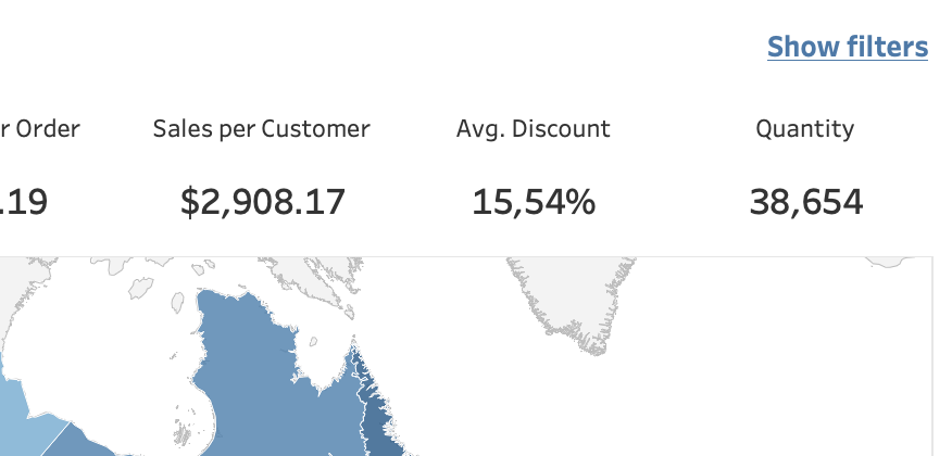
The Show/Hide button: don’t settle for the default!
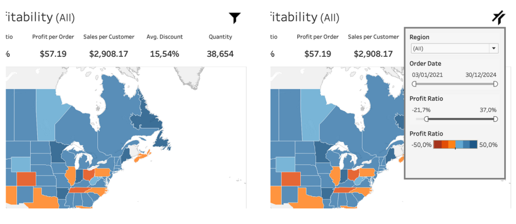
One of the most adopted features of Tableau in the last couple of years is probably the ‘show/hide’ function. Using just a single mouse click you can hide a single filter, a large filter block, different visualizations or a help text.
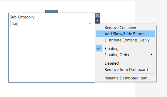
I love the functionality – but I hate one ugly, dirty thing: the default image for ‘show’. Why did Tableau choose this icon?
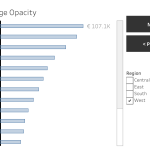
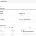
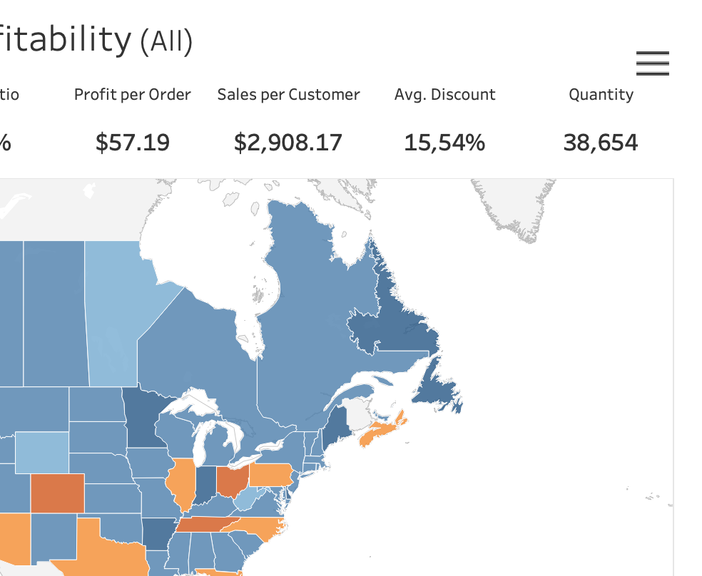 |  |
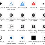
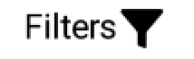
The icon – three horizontal lines, better known as the ‘hamburger button’, is used on the web and in apps to show navigation – not options:
Its function is to toggle a menu (sometimes referred to as a hamburger menu) or navigation bar between being collapsed behind the button or displayed on the screen.
(Wikipedia)
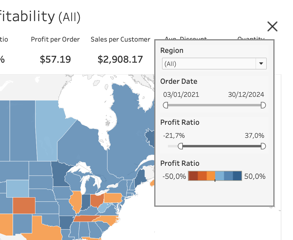
In a dashboard we usually don’t use this button to show a navigation menu, but almost always to show extra functionality like filters, parameters, configuration, or extra content (chart, help text, …)
How can we improve this?
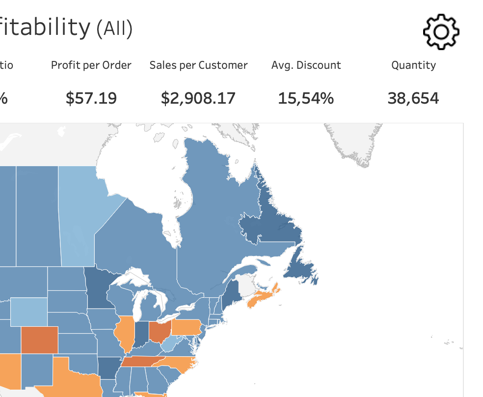
Option 1: a more suitable icon
For a filter block, you might want to use the gear icon. It’s an often used icon, especially in apps. And although the default close (X) button in Tableau is better chosen than the open button, it doesn’t hurt to be creative.
To users it’s often more clear when you use two similar icons for open and close than two completely different icons:
 |  |
Test the icons on real users!
In my personal opinion the new icons were very clear. But then I showed it to a user, and her reaction was:

“Why is this the icon of a configuration menu, while it opens a filter…?”
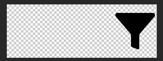
That was a very clear message I was wrong. Back to the drawing board, and look for an icons which represents a filter.
I found a funnel-icon which is easier to recognize as filter, and then created a second icon based on this one for ‘close’. This version of the icon received more positive feedback.
 |  |
Option 2: use text
Instead of icons, maybe just use text. In one or two words you can exactly say what is ‘behind’ the button. You can format it like a button (with a background color and borders), but also like a hyperlink (underlined blue text)
 |
Option 3: Icons and text
These two options can also be combined: add a helpful text next to the button. Tableau doesn’t offer this as a default, but you have got several options:
1. Add the text next to the button as a text element.
It’s easy, but you can’t click on the text to ‘show’, so it is not userfriendly
2. Add the text to the image.
Both text and image are clickable which is a big plus, but I find it often hard to create sharp looking text in Photoshop.
3. Create a transparent image and float the text beneath it.
When you create (or edit) the icon, make the image much larger on the left side with empty space (sample). If you save this as a transparent PNG you can use this as the button, and put the accompanying text beneath it. More work, but it results in a nice, sharp result:
 |
Conclusion
Although icons are usually small, they deserve lots of attention. Don’t settle with defaults, but choose the best icon you can find or create. Be prepared to spend some money on a good icon, it’s usually worth it.
It is all about creating a better user experience.