Small multiples charts (also known as trellis charts or panel charts) are a great way to visualize trends across different categories while maintaining consistency. They display multiple variations of the same chart, often sharing a common axis, which allows for easier comparison across groups.
While effective, these charts can suffer from poor readability if titles are not thoughtfully applied. Let’s look at some ways to enhance labels for better clarity and user experience.
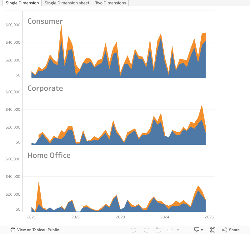
Decrease the distance between Title and Data
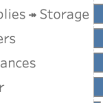
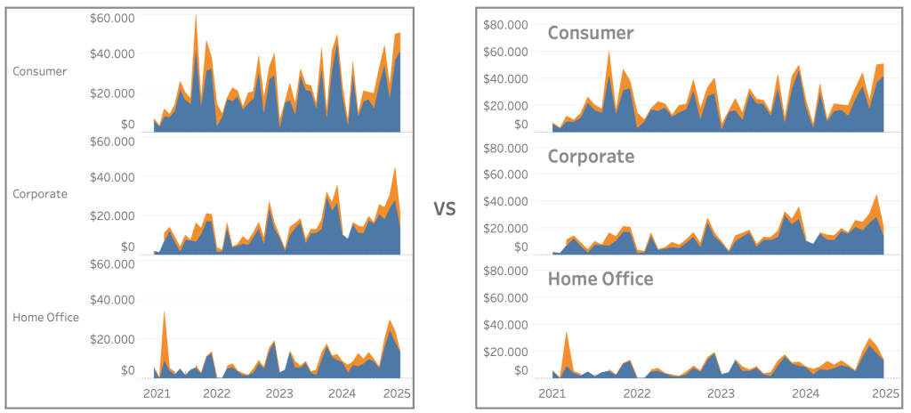
The standard method to identify each ‘panel’ is to look at the header of the axis. For example, on a simple sales chart divided per segment, you have to jump visually ‘over’ the axis to see the name of the segment. The formatting of the titles is also much too ‘modest’ – these doesn’t stand out, so you have to look for them:
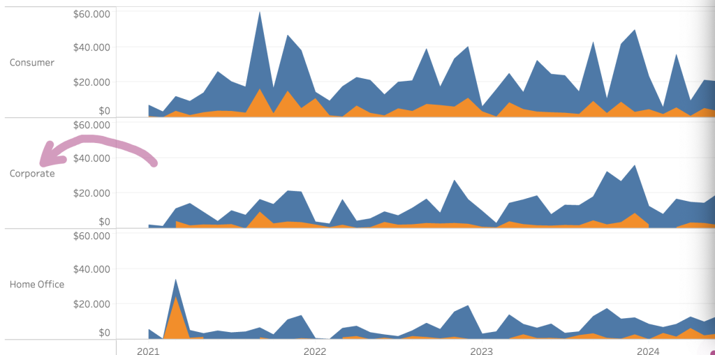
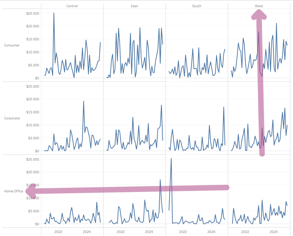
And on a multi-dimensional trellis this is even worse: the distance between the data (line) and the title is much too large!
How can this be made easier to the user?
Easy – but bad – fixes
The easiest way to make the title are better visible. It is an improvement, but it can/will take a lot of valuable space which should have been dedicated to data:
An easy ‘fix’ might be to rotate the labels – but there are few things less user-friendly (and ugly) than vertical labels:
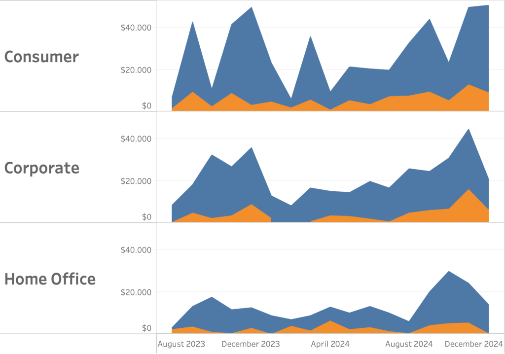
It would be much user-friendly if the titles are really near the data!
The Solution: Title per pane using Labels
It is not hard to add a label in each pane – using dual axis. And we only need a single calculation to make it possible.
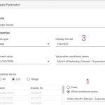
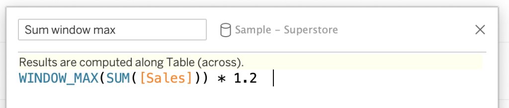
Step 1. WINDOW_MAX of all values
The title needs to be above the chart. Therefor we calculate the maximum value of Sales – that will be the y-axis value of the title. And because we want to make sure the title is really ‘on top’, this maximum value is multiplied by 1.2:
Step 2. Dual-axis
Drag this calculation to the Rows, right-click and select ‘Dual Axis’, and right-click on the axis for ‘Synchronize axis’.
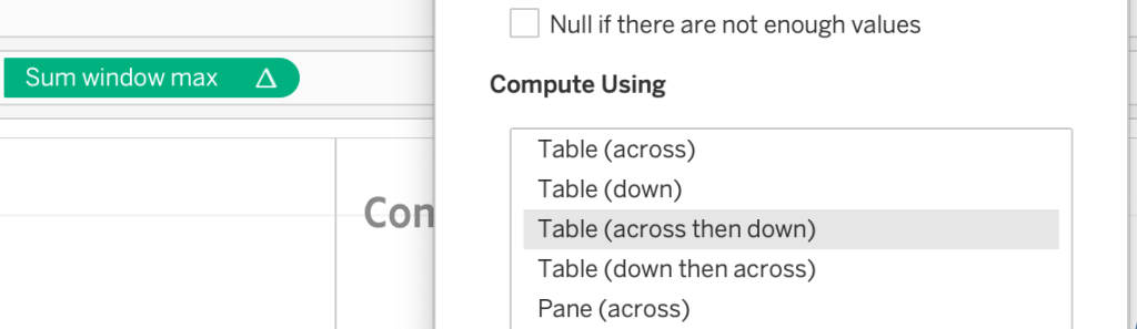
Step 3. Change the ‘Compute Using’ Table Calculation
This is not necessary when you only use a single dimension, but if you use two (like both segment and region) this is important.
The “WINDOW_MAX” of the SUM(Sales) is by default calculated on ‘Table (across)’. The result is a the maximum value per row – which can result in mis-aligned titles.
If you choose ‘Table (across then down)’ the maximum is calculated based on every mark.
Step 4. Labeling
The title of each pane is in this example Segment, so we drag this to the Label mark of [Sum window Max]. The segment-name is now shown on the right – wrong – side of the viz.
5. Mark-type to ‘line’, and hide it
Change the mark from ‘automatic’ to ‘line’, and hide it by setting the opacity to 0 (zero):
6. Change label-alignment and format
The final step: aligning and formatting the label.
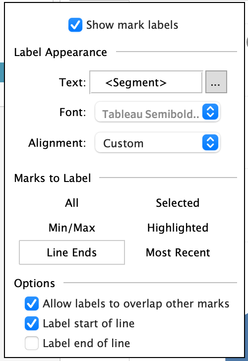
- De-select ‘Label end of line’, so only the start of line is labeled
- Set the font much larger and bolder than the default – e.g. Tableau Semibold, 18pt.
- A pure black title distracts possible a bit too much, so set the font to dark gray
- Play with the Alignment – using “Left/Center/Right” and “Bottom/Middle/Top’ you can format it to your liking
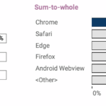
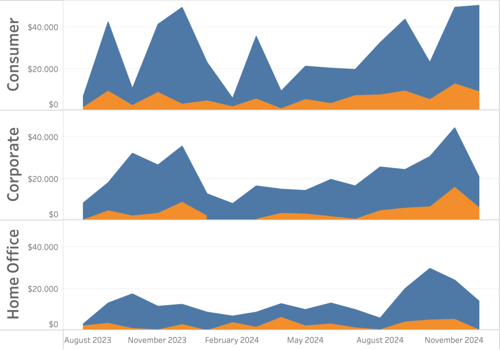
The end-result
The end-result is a visualization where no user needs to doubt what the data is respresents:
This method works very well in both simple, ‘single dimension’ panel charts as in trellis plots with two dimensions (like segment and region).