Every time you publish a chart that doesn’t start at zero, someone will appear in the comments accusing you of misleading your audience. But the truth is simple: not every dataset lives anywhere near zero.
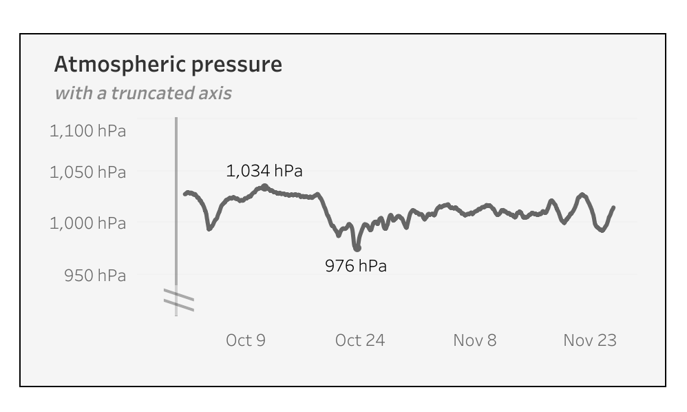
When working with high-value metrics – like atmospheric pressure, energy usage, or financial KPIs – starting a chart at zero often flattens the trend and hides important variation. Simply removing zero can help, but it can also exaggerate small fluctuations, making lines appear more dramatic than they really are. In this guide, I’ll show how to visualize high-baseline data in Tableau using dynamic axis adjustments, reference lines, and buffer zones to create accurate, readable, and visually balanced charts.
Cutting the zero-baseline
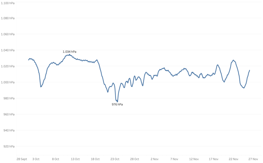
For this example, I’m using atmospheric pressure data from a weather station over a certain period. These values never approach zero, fluctuating roughly between 980 hPa and 1050 hPa. Displaying this on a zero-based axis would flatten the variation and make the chart harder to read.
Important: Non-zero axes are recommended for line charts or continuous data but should be used very cautiously for bar charts or magnitude comparisons.
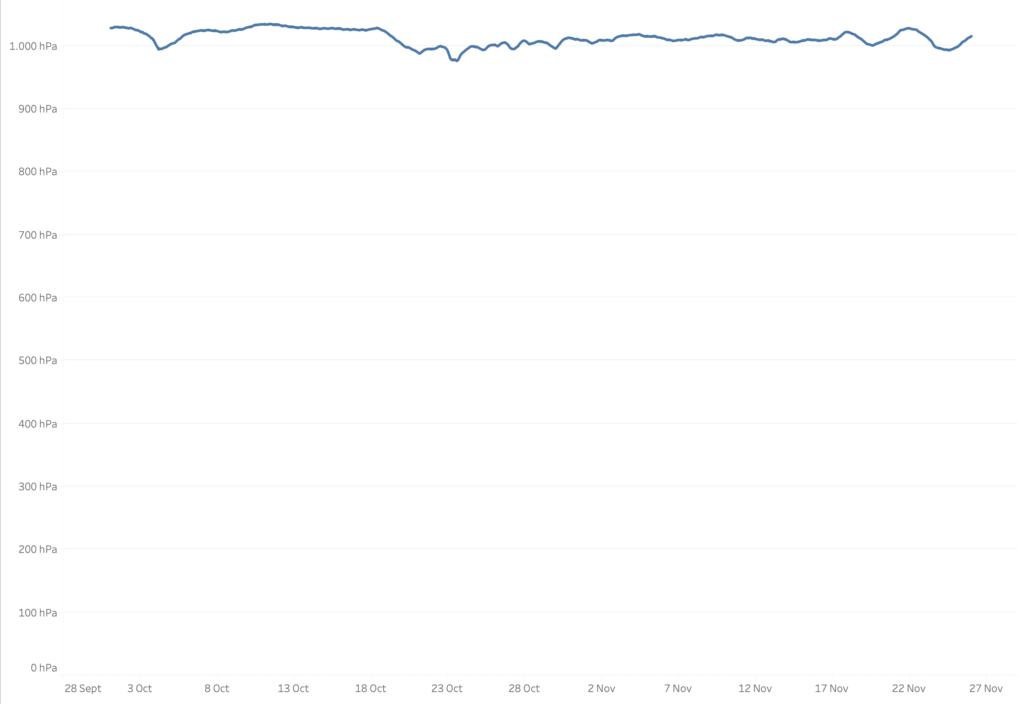
In Tableau, when you uncheck “Include Zero,” you get this:

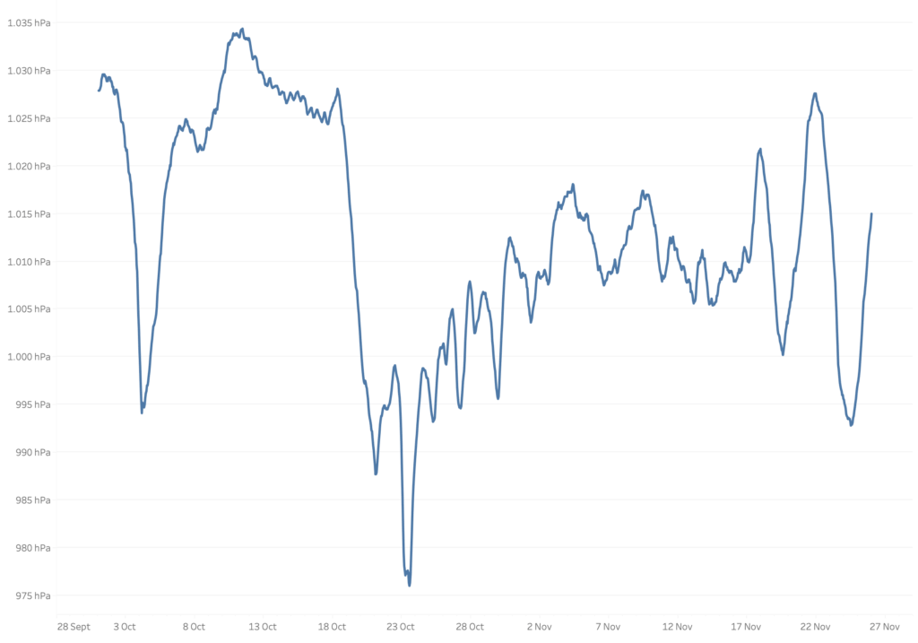
Now the differences between days and hours are clearer, but the chart can still be misleading. The atmospheric pressure on October 23rd looks almost zero, and the variation between minimum and maximum values appears exaggerated. Axis labels alone aren’t enough to clarify this.
Adding labels
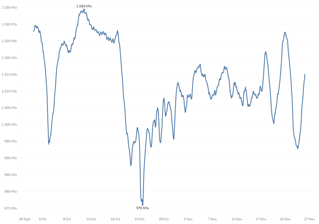
When labels are added, a little more context is available to the users. Just the minimum and maximum values are enough:
Creating white-space
Removing zero and adding labels help, but by themselves they don’t solve the problem. Visual perception works at a glance, and those steep spikes or plunges can exaggerate volatility that’s actually minor. To avoid that distortion while preserving the trend, it helps to add buffer space above and below the data line. Rather than hard-coding start/end values, dynamically calculating buffer zones from the data makes the solution more robust and reusable.
The simplest way to do this is by adding two reference lines – one as an upper buffer and one as a lower buffer.
The ‘math’ behind it is simple: I want to add as much space below the chart as the line0chart itself. So: subtract the difference between the maximum and minimum values of the current chart from the minimum value
//Lower Buffer
WINDOW_MIN([Measure]) - (WINDOW_MAX([Measure]) - WINDOW_MIN([Measure])
//Upper Buffer
WINDOW_MAX([Measure]) + (WINDOW_MAX([Measure]) - WINDOW_MIN([Measure])In this example, the difference between the highest and lowest value is 58 hPa, so we will add 58 to both to upper and the lower part of the viz:
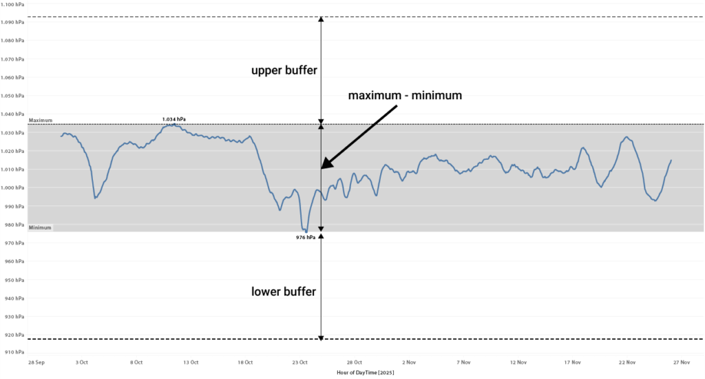
Add these two calculations to the Detail shelf, and create a reference band based on these values.
Add these calculations to the Detail shelf and create reference bands based on them.
Hide labels, tooltips, lines, and fill so the bands only serve to stretch the axis visually.
The – almost – final result
This is the result of stretching the axis: a much cleaner way to view at the data.
But there is another addition which makes it even more clear the axis is not starting at zero.
Finetuning: Adding a ‘broken axis’ with icon
In data viz it’s pretty common to emphasize that the axis does not start at zero (the same idea as breaking up a bar). Tableau doesn’t have a built-in option for this, but you can mimic the effect really easily. All you need is an extra reference line.
Avoid floating images – they can shift out of place, so stick with standard Tableau features.
No extra calculation is needed: add a reference line based on the minimum date to the date-axis:
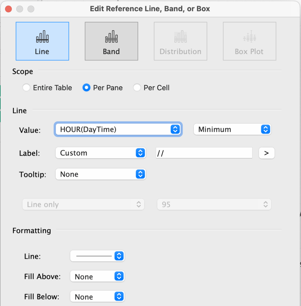
And for the Label I choose two slashes (/ /). This looks strange for the moment, but when you format the reference line (right-click on the reference line, and choose ‘Format’):

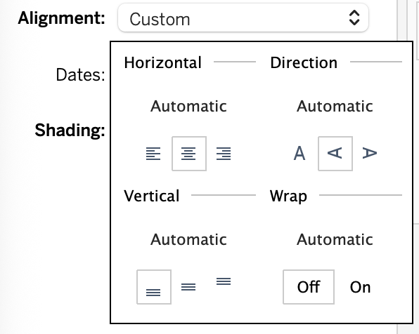
Set horizontal alignment to center, vertical alignment to bottom and – the Direction to ‘Up‘ (vertical). This last step is important – it will make the // look like a break of the line.
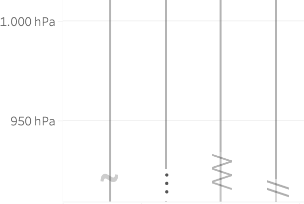
I did some tests with other ‘break icons’ like the tilde (~) , elipsis (…) and a combination of slashes and back-slashes (/\/\/), but in the end I like the two parallel slashes the most.
Final version
The final Tableau visualisation of atmospheric pressure – looks like this:
(you can download the workbook from Tableau Public to test it yourself)
By combining these techniques: removing zero, adding minimum and maximum labels, creating dynamic upper and lower buffers, and simulating a broken axis, you create a visualization that is both accurate and easy to read. The trend is clear, extreme values are softened, and the data’s story is preserved.


