In the world of digital analytics and customer journeys, not every user makes it to the finish line. Some browse a product, others add it to their cart, but only a fraction complete a purchase. Understanding where users drop off—and how many—can offer crucial insights for optimizing your process. That’s where funnel visualizations come in.
Funnel charts are a powerful way to illustrate step-by-step attrition across a defined process. Whether you’re tracking sales, onboarding, or lead conversions, a funnel view can make complex user behavior immediately digestible. Each stage visually narrows to reflect fewer participants, highlighting friction points and conversion opportunities.
Funnel Area Chart
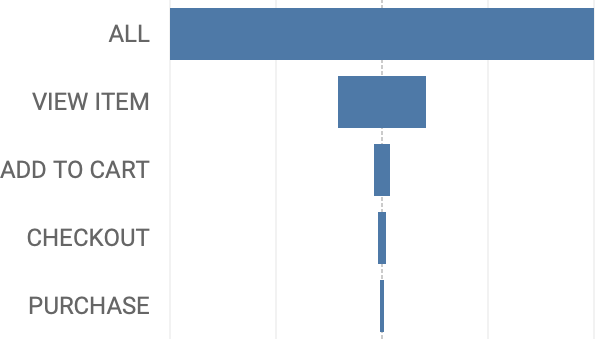
The most common method to visualize drop-off is using a funnel-chart. This chart-type focuses mainly on the drop-off per stage, and there are more ways to analyze the data
In this post, we’ll have a look at the Funnel Area Chart – which has a few advantages over the funnel:
- Better perception of size
- Good for labeling
- Scalable and modular
(of course the funnel-viz has its own advantages)
Data: Google Analytics / GA4
For this example I am using the BigQuery sample dataset for Google Analytics. It contains GA4 data for the Google Merch store in 2021. Using a combination of Bigquery SQL and Tableau calculations I defined 5 segments of website visitors, based on the purchase path:
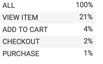
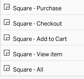
- All
- Viewed at least one product/item
- Add a product in the cart
- Started Checkout
- Finished the Transaction
Each of the segments is a part of the previous one: you can only checkout if you put something in your cart, etc. (Only if users are able to add a product in the shopping-cart without viewing the item-page this assumption is wrong)
Map-layers for Polygons
To create the squares for each user-segment we will be using map layers. This Tableau functionality is primary meant for maps, but are extremely powerful because you can use as many visualization layers on top of each other as you want – in comparison with the ‘just’ dual-axis of a standard visualization.
Scaffolding
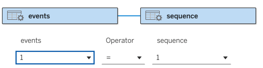
Each percentage (100%, 21%, …) needs to be visualized as a square – and therefor we need to create extra datapoints. Every measure needs 5 datapoints: each corner of the square, plus the first one duplicated to close the square. I added an extremely small dataset ‘sequence’ with only the numbers 1,2,3,4 en 5, and created a relationship with the GA4 events table on ‘1=1’ – so every row from ‘events’ gets duplicated 5x.
And this calculation is the base of each square – this creates five spatial points from start to end. Why the ‘SQRT’? This makes sure the surface of the square are visualized correctly.
Drag this calculation to the sheet, change the mark-type to ‘Polygon’ (the square is a polygon), and drag the [number] to Path. This sorts the different points, and creates the square.
If you succeeded, repeat it for every measure: calculation, drag on map, change to polygon, add number to Path. The different squares are stacked onto each other, so the ‘All’ must be on the bottom, etc.
Each polygon needs a different color – I choose 5 shades of blue.
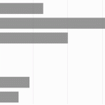
The Viz
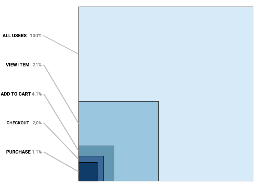
If you have created all calculations and put them on the sheet correctly, you will get such a visualization:
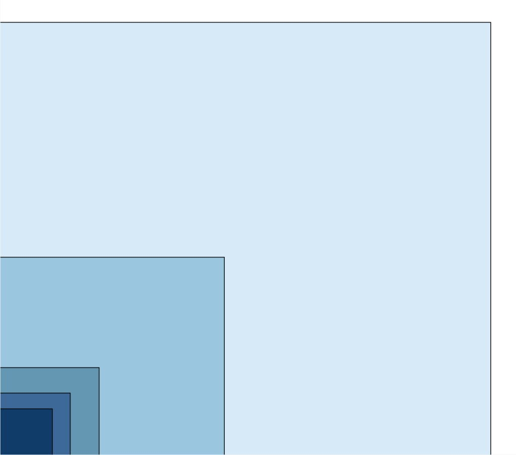
It looks beautiful (I think) – but it needs context. The different user-segments needs to be identified.
Labeling – part 1: Adding Titles
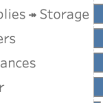
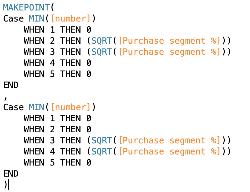
Polygons are not easy to label themselves in Tableau, so I created 5 extra calculations with the upper-right corner of each segment as a spatial point, like this;
MAKEPOINT(SQRT([Purchase segment %]),SQRT([Purchase segment %]))… and added them to the viz. I change the marktype to circle, minimize this circle and name all Segments per square.
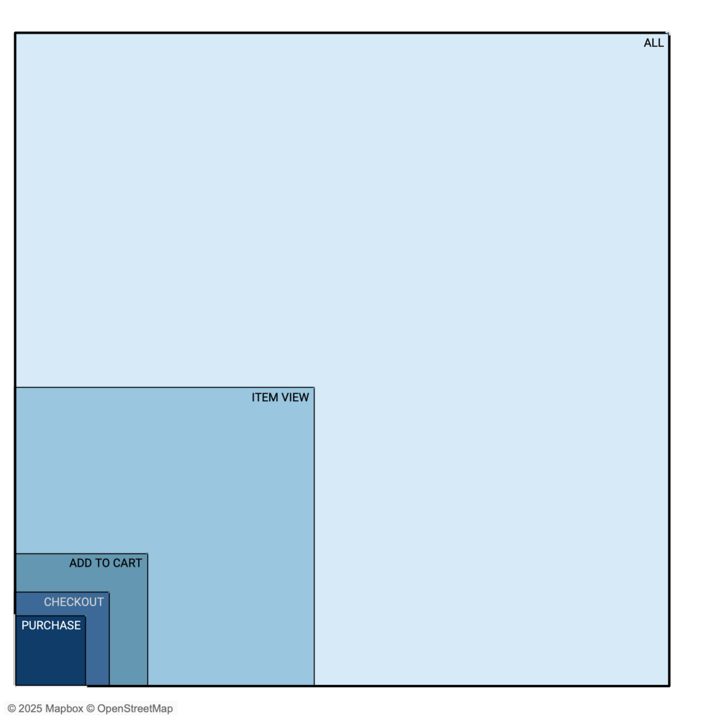
This is a really nice visualization!
But… what if the segments of ‘checkout’ and ‘add to cart’ are almost identical? This way of labeling only works if you are certain the segment-sizes differ ‘enough’ from each other, and also you have enough space for the viz (the purchase label hardly fits in this example)
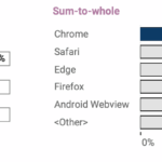
Labeling part 2: ‘Data proof’ Area Chart Funnel
To make this work “whatever the data” the labels need to be visible all the time, and connected to the chart (so not just a legend).
I ended up with putting the labels on the left of the visualization, and connecting them to the surfaces using a line. This meant adding 10 (!) extra map layers: five for every line between the label and the squares, and another five to label these lines. You can download the workbook to view all the individual calculations – and this is the result:
View – and use – the visualization on Tableau Public!
Let me know what you think of this using the comments on this LinkedIn Post.