• Skip to primary navigation
  • Skip to main content
Antichaos

Antichaos

Tableau, Data Analyse & Visualisatie

  • Home
  • Consultancy
  • Training
  • Blog
  • Showcase
  • About Me
  • Newletter
  • Contact
  • Show Search
Hide Search

Calculations

Add ‘All’ and more options to a Dynamic Parameter

Johan de Groot · 18 September 2025 ·

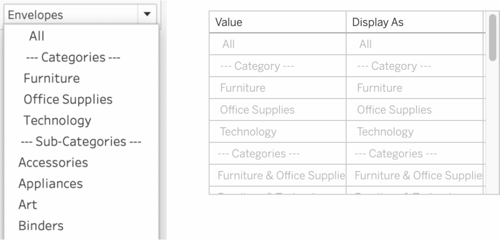
A couple of years ago, Tableau introduced one of its most highly requested features ever: Dynamic Parameters. This feature made it possible to populate a parameter with values directly from a data source, rather than being limited to static, manually entered values.

This works great, but as soon as this was available a new request came up: adding manual values to the list – especially the ‘All’ value.

[Read more…] about Add ‘All’ and more options to a Dynamic Parameter

Letting Users Choose Their Visual

Johan de Groot · 3 July 2025 ·

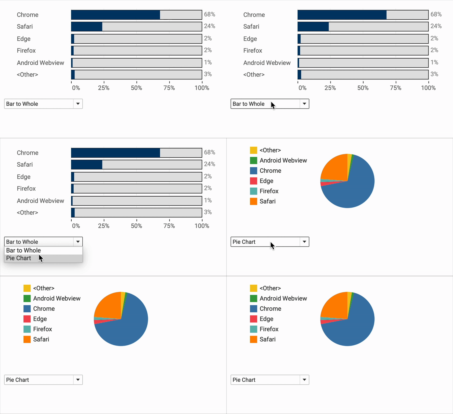
A powerful way of creating flexible, user-friendly dashboards is by letting your users decide how they want to view the data. Instead of forcing them to view at a certain chart type, you can give them the option to chose between different visualizations- bar charts, line charts, etc, or variations on a chart, based on their need, or preference.

[Read more…] about Letting Users Choose Their Visual

Responsive Labels – Smarter, Cleaner Dashboards

Johan de Groot · 22 May 2025 ·

Data Visualization is about visualizing data the right way.

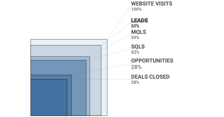
Interactive business dashboards tend to have a special challenge: the must display data with accurate labels, regardless of how the data changes from day to day. Many infographics visualizations are using static data – and therefor the labels can be put on the most convenient location. But what happens when the data changes – either due to new data, or filtering? Labels will overlap, disappear, and/or get mixed up.

The funnel chart is one type of visualization that’s especially prone to this, even with just a few data marks. While working on one, I came up with a solution to keep all the labels nice and clear, no matter what the data throws at it. Bonus: it’s flexible enough for easy customization!

[Read more…] about Responsive Labels – Smarter, Cleaner Dashboards

Change marks on Hover

Johan de Groot · 8 May 2025 ·

Sometime you want to make a dramatic statement – and sometimes you just need a little nudge to help users understand a dashboard.

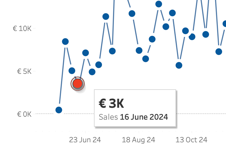
Tableau makes it really easy to create a minimalist dashboard – and tooltips are a great way to unlock the data behind a mark. Emphasizing the datapoint of the tooltip will make the visualization just a little better. And this is even more important on charts with multiple lines.

[Read more…] about Change marks on Hover

Improve Titles on Small Multiples

Johan de Groot · 27 February 2025 ·

Small multiples charts (also known as trellis charts or panel charts) are a great way to visualize trends across different categories while maintaining consistency. They display multiple variations of the same chart, often sharing a common axis, which allows for easier comparison across groups.

While effective, these charts can suffer from poor readability if titles are not thoughtfully applied. Let’s look at some ways to enhance labels for better clarity and user experience.

[Read more…] about Improve Titles on Small Multiples
  • Page 1
  • Page 2
  • Go to Next Page »

Antichaos

Copyright © 2025