Often improving a dashboard is about small changes. Have a look a this chart:
[This blogpost is part of a series tips tricks, as being presented at VizIt Berlin 2023]
[Read more…] about Improve layout of percentags – Better labels in TableauAntichaos
Tableau, Data Analyse & Visualisatie
Often improving a dashboard is about small changes. Have a look a this chart:
[This blogpost is part of a series tips tricks, as being presented at VizIt Berlin 2023]
[Read more…] about Improve layout of percentags – Better labels in TableauDatefilters are one of the most common filters on any dashboard. They are needed to see trends, make decisions on the right period, and analyse within the right context. But most of the times these filters are not optimal – so let’s make them better (and prettier)
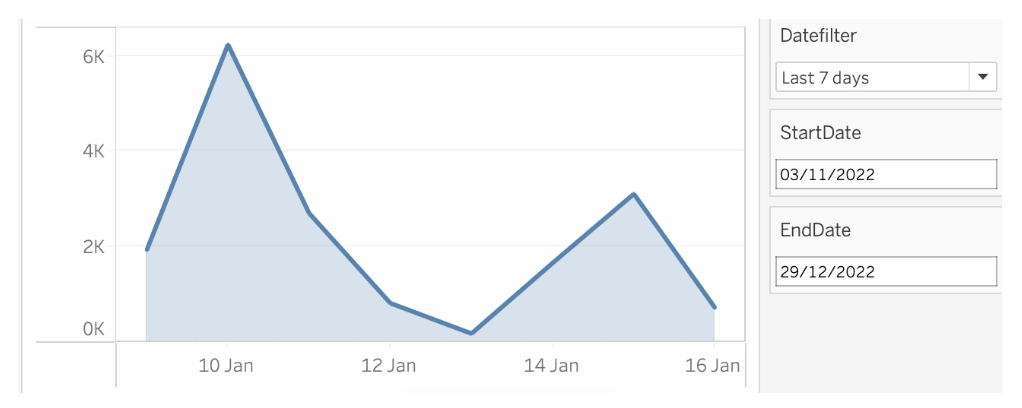
[Read more…] about Better datefilters in Tableau
I visualized the Top 2000 as broadcast by Radio 2 for the 11th time (I believe) in a different way using Tableau.
[Read more…] about The Radio Top 2000 visualised – edition 2022De Top 2000 zoals uitgezonden door Radio 2 heb ik gevisualiseerd met behulp van Tableau.
Dit jaar wat minder nadruk op een de vorm (hoewel ik heb gekozen voor een gedempte sinus, wat niet bepaald een veelgebruikte manier van weergeven is…).
[Read more…] about De Top 2000 van 2022 gevisualiseerdTableau has created a nice blog post on Tableau Forum Ambassadors. It describes what these ambassadors do, how they can be used on the Tableau journey,
[Read more…] about Featured Forum Ambassador