[part of the ‘Datafam London 2024 series]
In part 1 we took a look at a basic bar chart, and ended with the lollypop chart. A fun chart with one major issue: the dot obfuscates the real datapoint.
Punctuated Bar Chart
One solution for it the Punctuated Bar Chart:
We highlight the end of each bar, instead of enlarging the endpoint.
Just like the lollypop chart it is a dual-axis chart, but instead of the delicious sweet circle we use the gantt-chart. This creates a line at the end of each bar.
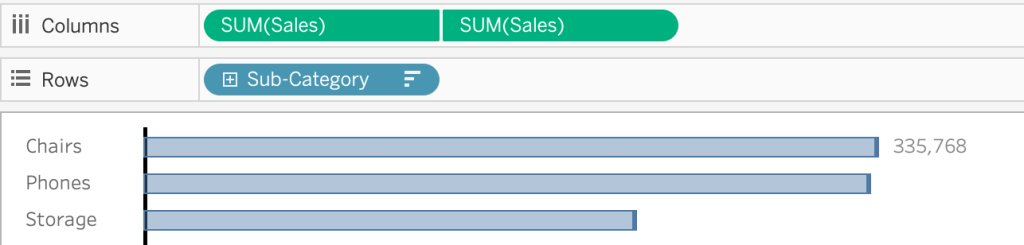
Very subtle – but probably a bit too subtle.
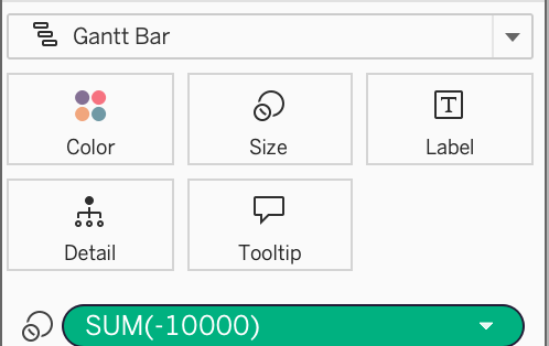
To punctuate the marks better, add a negative value to the size of the gantt-bar. A size-value on a Gantt bar adds this value on top of the line – therefor a negative value is needed to avoid lengthening the bar.
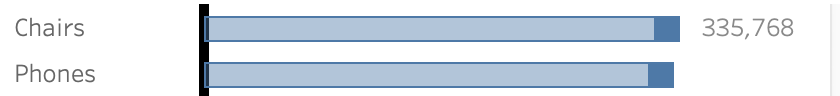
This will highlight the end of the bar much better!
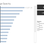
But… how do you know which value you should choose?
I used “-10.000” just by experimenting, but if you filter the viz the punctuation changes, which isn’t very pretty:
If the size is too small it’s hardly visible, if it’s too large it ruins the viz…
Calculate the right punctuation
By using some clever window calculations you can make this work for every possible value in bar-charts:
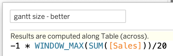
This calculation relies on the size of the largest bar (window_max), and ‘colors’ the last 5%. This gives a consistent look on all values – large or small:
Keep refining!
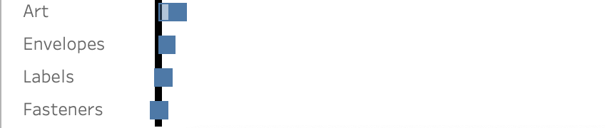
Never assume that if it looks good now, it will look good in all situations. If the sales-value of one of the sub-categories is quite small, its bar is going into negative spaces…:
This can be solved by changing the calculation. The idea is simple: if the punctuation is larger than the bar itself, use the size of the bar as the punctuation:
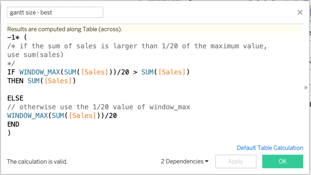
The end result is this bar chart, which highlights the data points really nicely, doesn’t obfuscates the data itself, and also never shows weird results on smaller values:
![gantt size: -1* ( IF WINDOW_MAX(SUM([Sales]))/50 > SUM([Sales]) THEN SUM([Sales]) ELSE WINDOW_MAX(SUM([Sales]))/50 END)](https://public.tableau.com/static/images/J9/J999PWHHQ/1_rss.png)