A powerful way of creating flexible, user-friendly dashboards is by letting your users decide how they want to view the data. Instead of forcing them to view at a certain chart type, you can give them the option to chose between different visualizations- bar charts, line charts, etc, or variations on a chart, based on their need, or preference.
In this post, I’ll walk you through the concept and show you three practical examples where users can choose their visual using a parameter.
Needed: A plan, a parameter and Calculated Fields
The core technique relies on some simple actions in Tableau, but requires a good plan. You need to decide
- what is shown (e.g. bar chart or line chart)
- what the differences are between these (do you need a legend on either viz?)
- and – also important – how do users switch between them? The technical answer is ‘a parameter’ – but there a several ways to implement this.
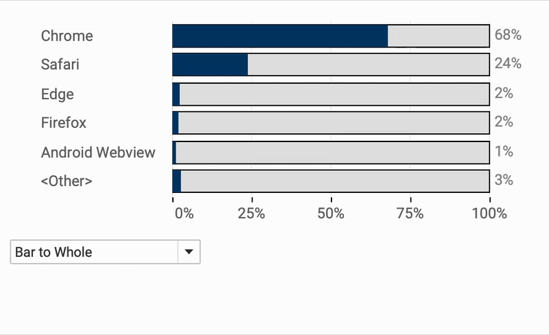
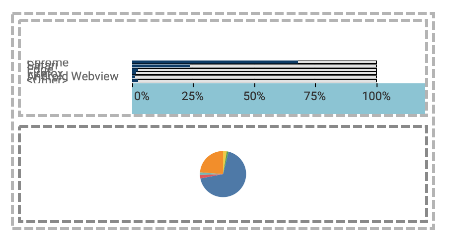
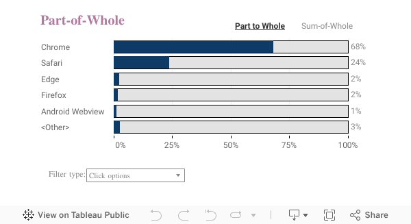
In the first example I am going to switch between a pie chart the a ‘part to whole’ bar chart:
Pie-charts are often requested by stakeholders – but you might want to give users a better option to view the same data…
Parameter, Calculated Fields, DZV.
Start by creating the parameter which defines the chart to be shown.
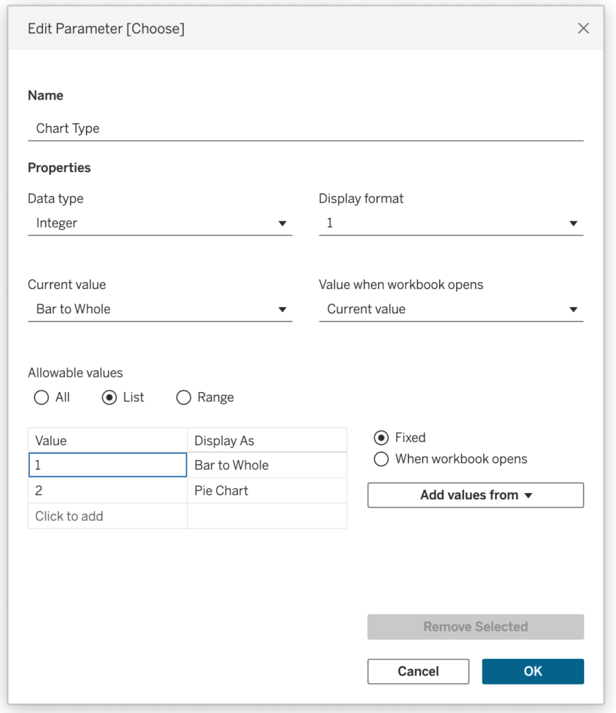
Two calculations are needed – one for each viz:
Dashboard
Create the dashboard using a container with both visualizations.
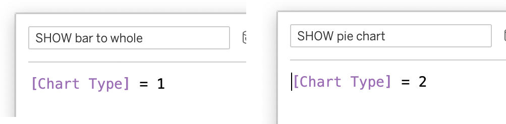
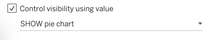
Use Dynamic Zone Visibility for each chart – using ‘SHOW pie chart’ for the pie-chart, and ‘SHOW Bar to Whole’ for the other one.
Using the parameter you can now change between the two charts:
If you need the legend – a clear disadvantage of many pie-charts
Choose the method of switching
The drop-down is the most easy way to implement the switch. But it is not always the easiest to understand. I have implemented three different options
The drop-down option is just the parameter minimized – the other two are using parameter-actions to change the parameter. Download the workbook for details – or wait for the future blogpost on this!
Final Thoughts
This technique is about giving your users the ability to switch perspectives. One chart can give you the clearest story – but sometimes a different view tells it better. By letting users change the chart type directly, you’re turning your dashboard into an adaptable tool that fits different questions, roles, or contexts.