In the endless pursuit of creating better charts, let’s look at the line-chart. Probably the most used chart of all times, since it often shows a metric (sales, quantity, temperature, …) over time.
I already discussed focusing on what is important in the article on “betters ways to compare years“. But how can we improve the default, remove distractions and focus more on the data? Let’s look at some simple steps you should do every time you create a line chart – and finish with a less common but visually pleasing ‘advanced’ one!
[part of the ‘Datafam London 2024 – Deepcleaning your dashboard’ series]
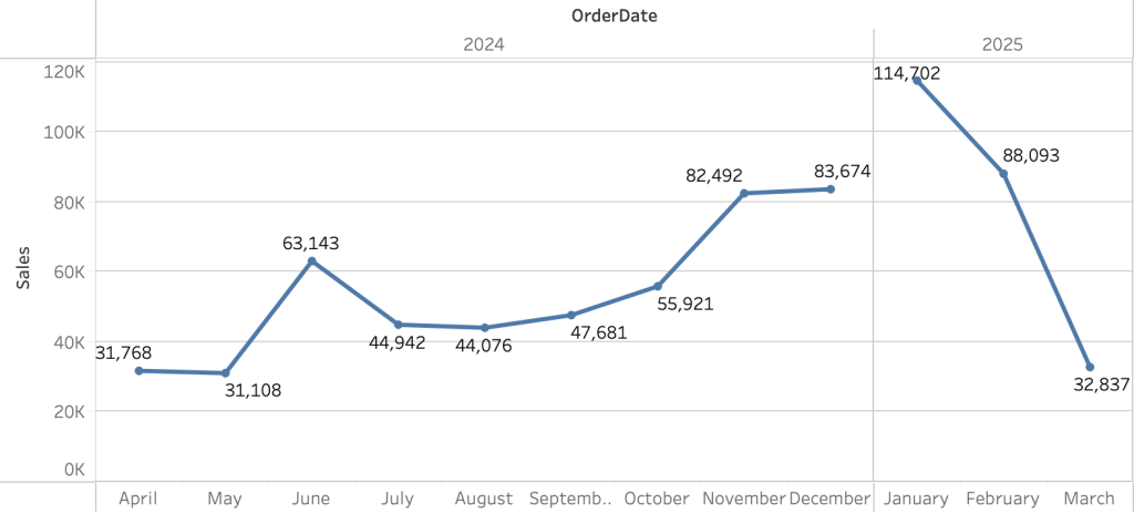
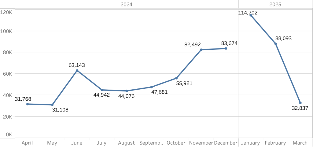
This is what we are starting with: a line chart in Tableau created using just two ‘swipes’ and a click: Date Year/Month on the Columns, and Sales on the Rows.
Simple steps: cleanup
On my presentation @ Datafam London 2024 we did these steps together with the audience. The steps are usually known by the ones who have been working with charts in Tableau for a longer time:
1. Clear the Axis Titles
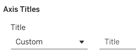
The title in the axis is hard vertical, too close to the axis-labels, and therefor hard to read. Make sure the title of the chart is descriptive, and remove this text from the axis (right-click on axis, and clear the ‘Title’
2. Hide Field Labels
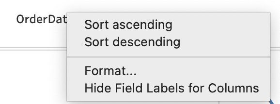
Same for the header of the cart: Remove the field label by hiding it, so ‘Order Date’ is not shown anymore.
3. Remove Gridlines
Although we assume the grid-lines would help us read the right values, they distract from the data. Remove them – or make them much more subtle:
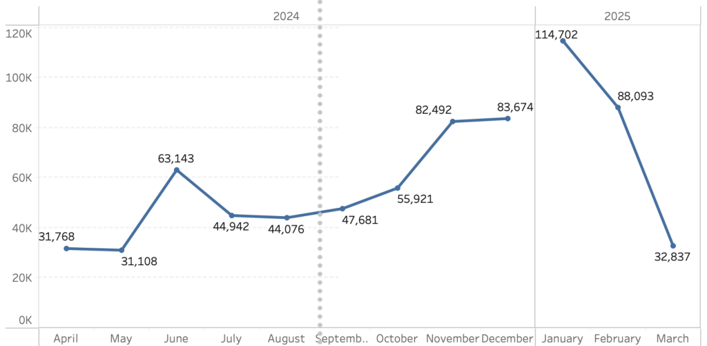
Making them more subtle is done by using a light gray-scale color.
4. Remove unnecessary labels
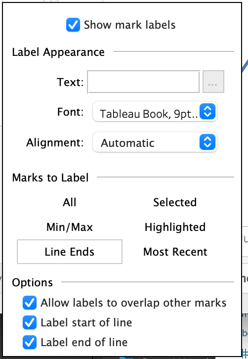
Labeling every mark on a chart is seldom useful. If you need to know the exact value of a mark, use the tooltip.
The easiest way to minimize the number of labels is changing the ‘Marks to Label’ on the Label mark to ‘Line Ends’
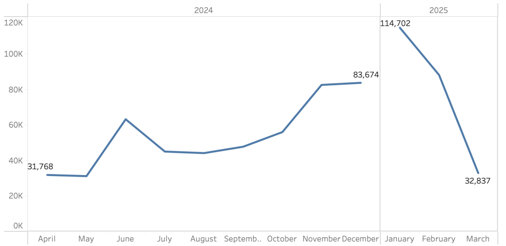
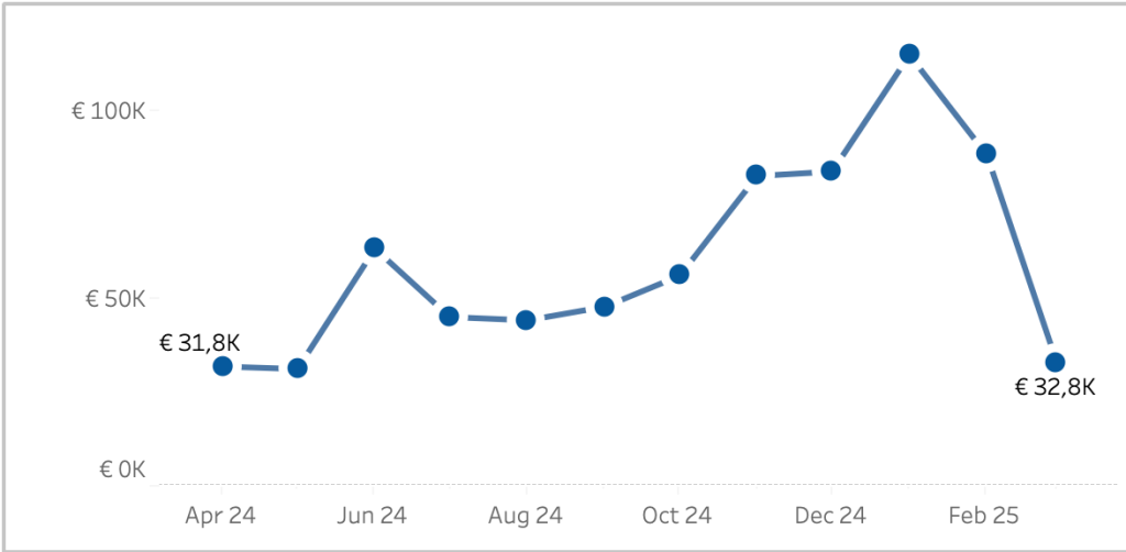
5. Remove the break by changing from Discrete to Continuous
The line is broken between December and January – but is this useful? The break distracts from the data – so remove it if it’s not useful.
Changing the date from discrete (with blue pills) to continuous (with green pills) modifies the line to a single piece:
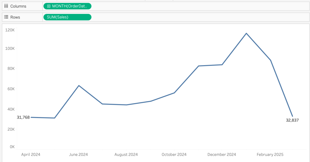
Don’t forget to remove the title from the date axis, just like we did with the title for the measure!
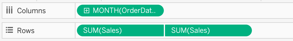
6. Emphasize the data
Minimizing the chart left us with a line which needs some attention. The individual marks are not very clear to see, so this can cause confusion by the users of the dashboard.
Create a dual-axis chart with the same measure, only change the marks-type for one of these to circle:
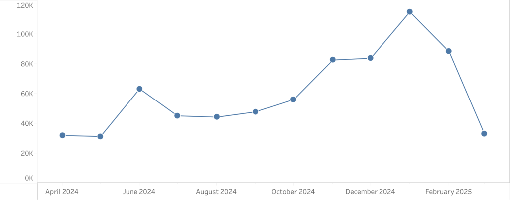
This makes the individual marks much more clear – but the line now looks a bit old-fashioned, Excel like. Is there a nicer way to focus on the data-points and the trend?
Yes!
Focus on data and trend

My idea on how to improve this is to make the individual marks more prominent. The default ‘circle’ mark doesn’t give us the option to make it really distinct from the line chart, but using a custom shape it is easily possible!
In Photoshop I created a white circle – the color of the background – with on top of that a blue dot – the same color as the line. (Powerpoint, Figma or any other graphical tool which can export jpg or png will do).
Download the icon using this link (right-click, download), or create one yourself.
Copy the file a new or existing directory of your My Tableau Repository/Shapes folder. On a Mac you can find this in the Document folder, on Windows in My Documents.
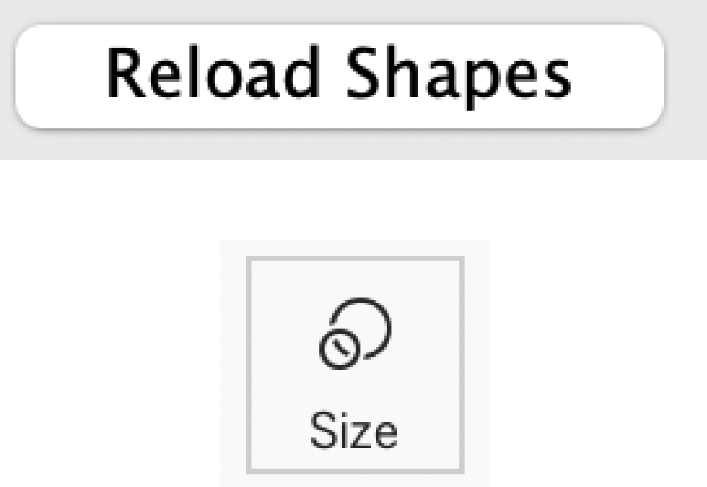
Change the ‘circle’ mark from the viz to ‘shape’, choose mark ‘Shape’ > ‘More Shapes’, click on ‘Reload Shapes’. You probably have to fiddle with the Size of the shape to get the best result – but there it is:

