Pie charts — they seem to be everywhere. They show up in presentations, reports, and in every stockphoto about business meetings.
They’re colorful, round, and look super friendly… but despite being one of the most popular chart types, they’re also one of the most frustrating to actually read.
But what should I use instead?
The classic response to the dreaded “What should I use instead?” question is usually: “A bar chart!” And, honestly, that’s usually good advice. But if there’s one thing pie charts do better, it’s showing how a piece fits into the whole — that part-to-whole story in a single glance.
Stacked bar-charts are often ‘almost’ as bad as pie charts, since it’s hard to compare the different parts, and it is also hard to label these.
Alternative 1: Part of Whole
If you want to show the percentage of a category out of 100%, a simple bar chart can work really well. By adding a full-length bar (‘whole’) behind the smaller bar (‘part’), you create an easy-to-read part-to-whole comparison.
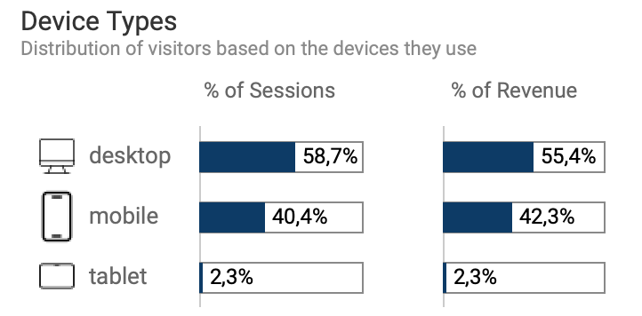
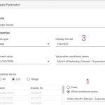
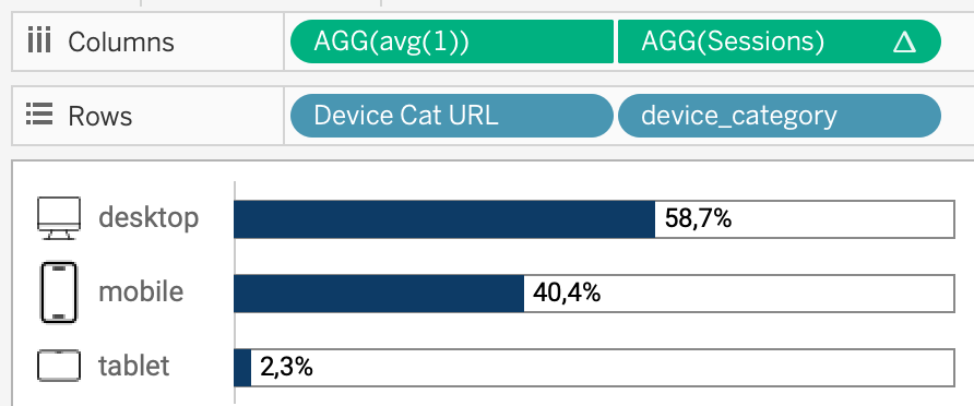
In Tableau this is easy: create a dual-axis bar with the value-percentage on the one axis, and a AVG(1) on the other one. First synchronize the axis (right-click on the axis, select ‘synchronize…’), and hide the headers by un-ticking ‘Show Header’ on both axis.
Click on the AVG(1) pill, and select white for the color, plus a clear border. (In my example I added an icon using Image Roles)
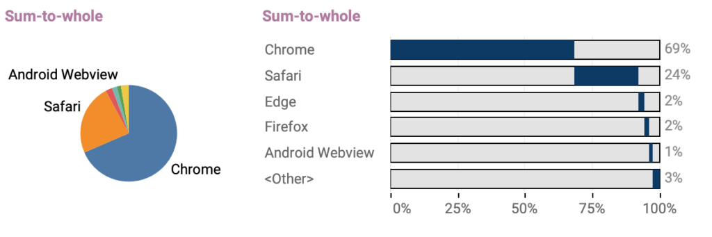
Alternative 2: Sum to whole
Sometimes users are ‘afraid’ of missing out data. In a pie-chart the values clearly add up to 100%, but a bar chart doesn’t show it. Even on the above mentioned method you are not sure if there is no fourth device-type, unless you sum the values yourself.
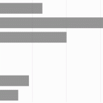
This alternative is a combination of a bar chart and a stacked bar-chart. Each value has got its own ‘bar’, but the consecutive sorted values clearly add up to 100% by starting at the level of the previous value
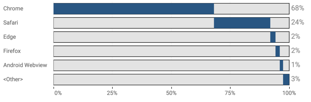
Start by re-creating ‘alternative 1’, with the dual-axis on avg(1). Sort the dimensions (in my example: the browsers) on the value (sessions) descending.
Then, create two calculated fields:
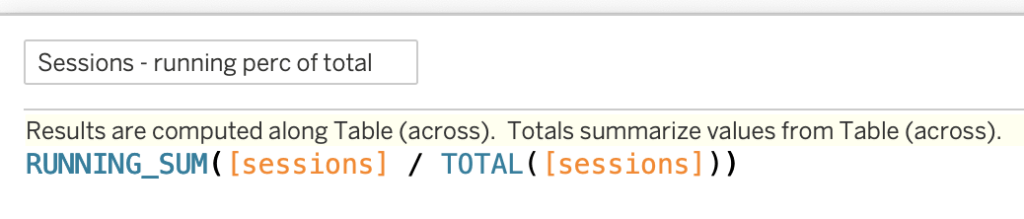
Sessions – running perc of total
This returns the percentage of total of the running sum.
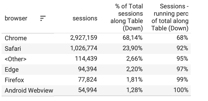
This table explains how this looks like: the number of sessions is added up by the preceding values, and that value is compared to the total of all sessions:
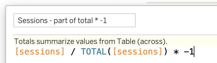
The second calculations is ‘Sessions – part of total * -1’. This is the percentage-of-total (second row in the table above), multiplied by -1:
After creating these two (table) calculations you can finish the viz:
- Replace ‘sessions’ on columns by [Sessions – running perc of total]
- Set the Marks type of this pill to Gantt Bar
- Drag [Sessions – part of total * -1] to ‘Size’
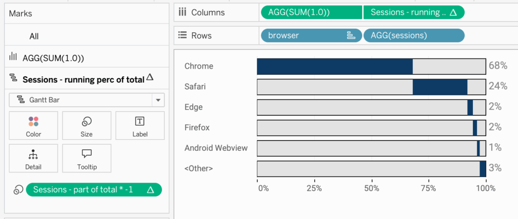
The Gantt bar adds small marks (lines) on each bar to show the running total of the values. By subtracting the current value of these marks (using ‘size’), you create bars that start where the previous one ended and extend to the current value, effectively showing a continuous progression.
Finishing Touch
To make it a bit more clear, I add the value of each dimension at the end of the bar (so it’s easier to read). Setting the range of the axis from 0 to 1.2 (120%) makes sure the label is displayed outside of the bar.
And for reference I changed the axis. Usually I hide the axis, but in this particular case I kept it for better reference, with tick-marks on 0.25.
Two approaches – Interactive:
These are the two interactive versions side by side – each with their own purpose.

Remember: it’s not about replacing pie-chart with ‘something else’, but about creating data visualizations which are better to understand!
Both examples are used in the Web Analytics dashboard, where many visualization types are being used to create a good overview of the data