Tableau containers don’t exactly have the best reputation. Most people either ignore them or wrestle with them. But once you actually get along with containers (and their friends: borders, background colors, and padding), they turn into your dashboard’s interior designers.

In this post, I’ll show you four small but powerful ways to use the Tableau containers to make your dashboards look sharper, cleaner, and maybe even a little more fun.
Some general knowledge of Tableau containers is needed to follow along these examples – you have to know how to put an object (sheet or other container) inside a container, know where to set the background-color and both inner- and outer padding. A good start for each example is to set all padding to 0px on all sides.
Dropshadow
A drop-shadow looks always fancy. Creating one can be done using different methods like floating objects, images, etc. This method has the advantage that it automatically scales with the parent-object.
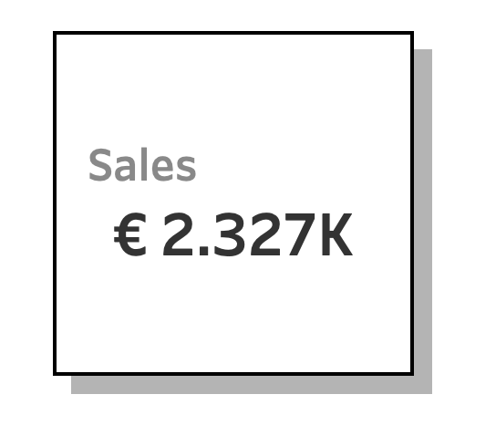
This whole block consists of 5 elements: the sheet (Sales), 2 blank elements (the shadow right and bottom), and two containers. The ‘trick’ is to use the outer-padding on the blank elements to suggest the shadow effect:
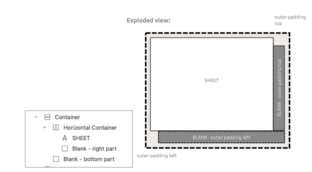
Download the workbook for the details.
Accolade
If shadows make things look more real, what about shapes? Tableau won’t let you go wild with circles and arrows like a design tool, but with some creativity, you can fake your way into something useful like an accolade.
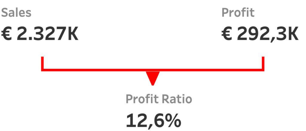
Because you can’t choose the border-width of the individual sides of an object, you need to use a different way to create these borders. The lines are just two objects: a red container, and a white blank object inside it. By using the outer-padding on the blank object the underlying red color is visible – mimicking borders.
The ‘arrow’ is just a UTF-8 character – ▼ – in a textbox.

Separators
Of course, not every trick has to be loud and flashy. A very subtle way of using containers is using them as separator between measures. Separating them gives a little more focus on the individual measures:

These separators are just blank dashboard elelemnts of a single pixel wide with a dark background and a top-and bottom padding of 20px.
Download the workbook for the details.
Navigation Tabs
Once you’ve mastered shadows, shapes, and separators, the next natural step is to get a bit more interactive. Enter navigation tabs: a good and proven way to navigate through different parts of a dashboard.

The text of the tabs are different Navigation Objects.
These objects are within a container with a black background – and this will be used a the border of the tabs.
The not-selected navigation buttons (the tabs) have a light gray background, with an outer padding at the bottom of the navigation. The selected navigation-tab is exactly the opposite: white background, and an outer-padding on the left, top and right part.
All examples in a single workbook
Have a look at the live examples, download the file, and make your own formats using containers, borders, padding and colors.
More ideas!?
These are just a few starter ideas. The real power of containers shows up when you start mixing and matching their features. Got a favorite hack of your own? Please share it!
