Line charts are one of the best and popular ways to show how data has developed over time. It’s a simple graph that is familiar to anyone, but the default generated can often be improved – either in Tableau, Excel or any other tool.
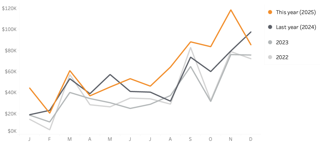
In this blog post I want to show how a relative small change in a line chart can result in a big improvement.
[part of the ‘Datafam London 2024 – Deepcleaning your dashboard’ series]
[Read more…] about Line-chart: betters ways to compare years