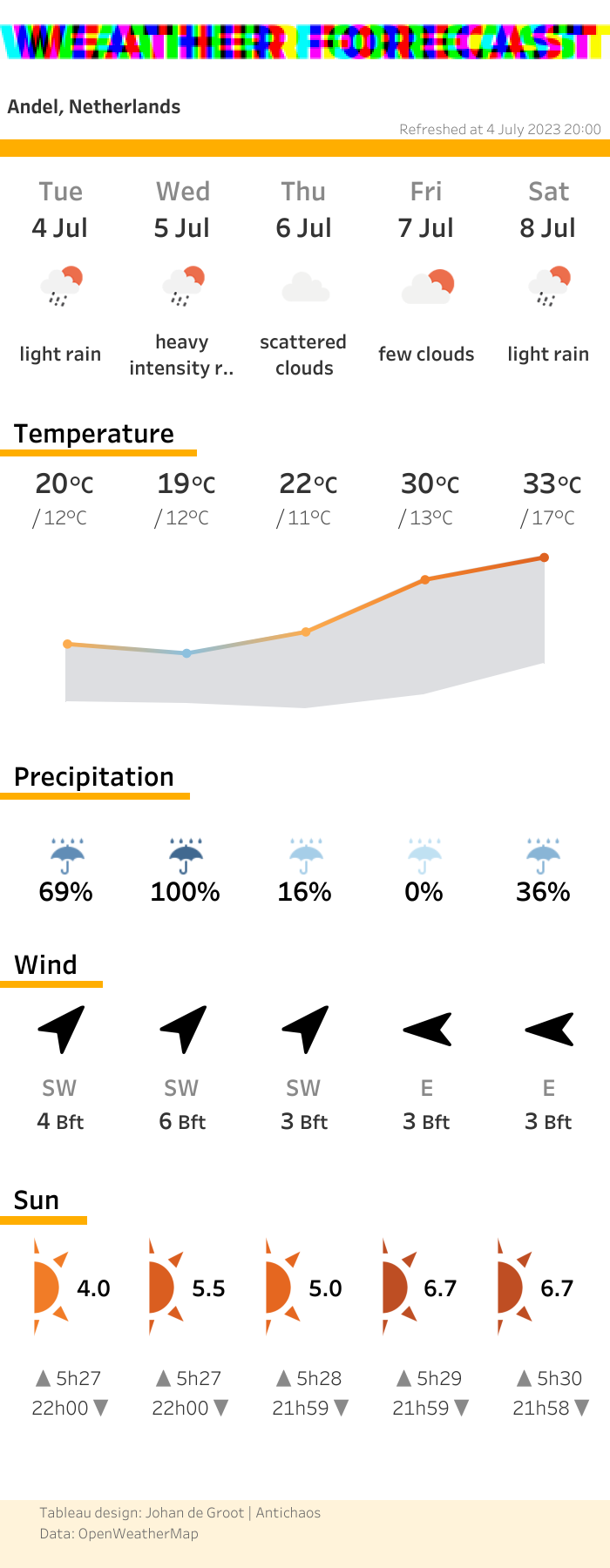
The most talked about topic in the world is probably the weather. And if you want to talk about, you need to know the data 😉
This dashboard show the weather forecast in my location for today and the next 4 days.
This dashboard had a couple of steps (challenges…) I had to take to make sure the visualisation keeps up-to-date.
(Tableau Public only allow refreshes once-a-day using Google Sheets, and you never know what time the data is refreshed).
The individual repeating steps are:
- Getting the data: pretty easing using the Openweather API and Python.
- Prep the data to a Tableau-usable format: I use Python script which extracts the necessary fields and puts it into a dataframe.
- Publish the data to Tableau Server: using the Tableau Hyper API (to convert the dataframe to a hyperfile) and the REST API I can publish the data directly on Tableau Server
- Fetch the visualisation: the static but up-to-date ‘screenshot’ of the visualisation is being exported from Tableau Server to a webserver using the REST API.
Besides these ‘re-occurring’ steps I needed create the dashboard itself. The visualisations itself aren’t that hard to create, but the main challenge was to create a ‘weather-proof’ dashboard:
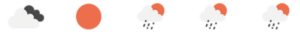
If I get the data for only 5 days – how do I make sure the icons for future weather-conditions (snow, fog, sunny, rain, …) are all assigned to the right members of the 18 weather-conditions dimensions of the OWM API? You can’t map an icon to a member of a dimensions which doesn’t (yet) exists…
The same problem occurs in a different part: not all possible wind directions will show up in a single forecast.
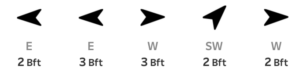
This problem can be solved in two different ways: creating ‘fake’ data-points to assign all possible, or the edit (hack) the Tableau workbook file and code the icon-mapping myself. I chose the latter.
To be continued..
In future blog-posts I will explain how to fetch the API data using Python, prep the data, publish the data to Tableau Server and automate downloading a up-to-date screenshot (all in a single pass), and how to hack a Tableau workbook to assign non-yet-existing values to icons.