Line charts are one of the best and popular ways to show how data has developed over time. It’s a simple graph that is familiar to anyone, but the default generated can often be improved – either in Tableau, Excel or any other tool.
In this blog post I want to show how a relative small change in a line chart can result in a big improvement.
[part of the ‘Datafam London 2024 – Deepcleaning your dashboard’ series]
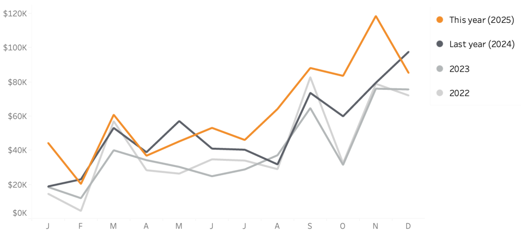
A ‘usual’ line chart with year comparison
Let’s have a look at a line chart which is so common in many dashboards:
It’s easy to create such a chart in Tableau: put the month on the Columns, Sales (or any other measure) on the Rows, and the Year of the date on the color. For ‘clarification’ we show the year label at the end of each line.
It works – but is not optimal (to say the least). Let’s focus on just two parts: color and labels::
- The colors of the years are random
- Next year a new line will appear with a new color
- Hard to focus on the ‘reference’ year (this year)
- Labels are hard to read.
Remember the main goal of the chart
The main goal of this chart is – probably – to compare the performance of this year with these of previous years. So the current year is the most important. And we want to compare this year with previous years.
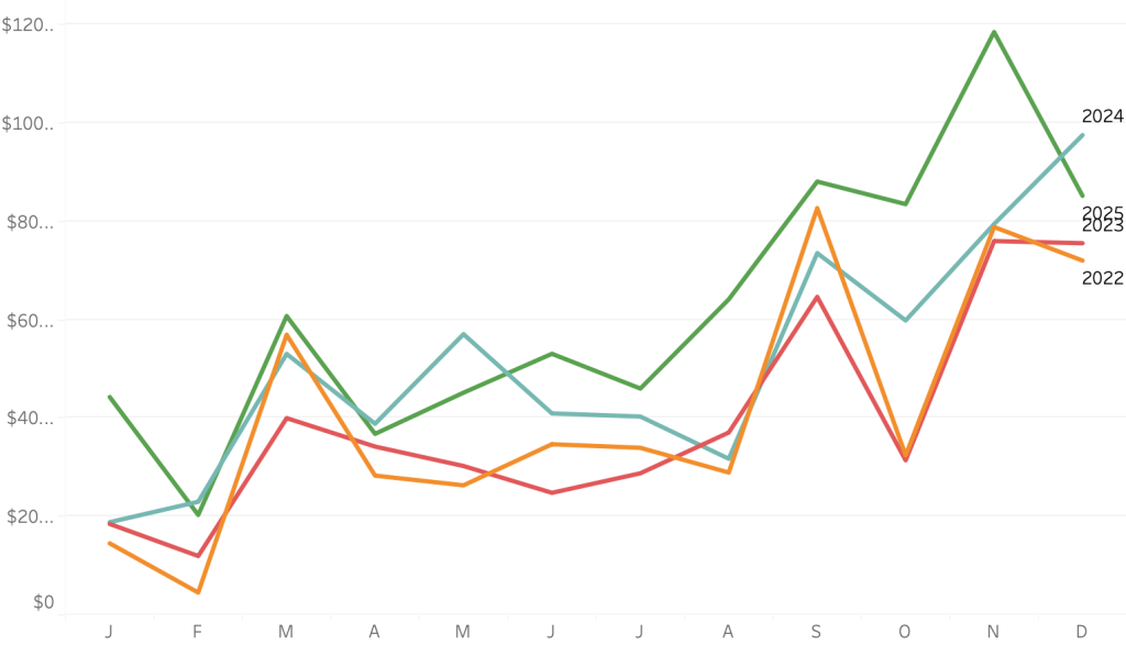
Highlight by difference in size?
One method is to make the line of current year bolder/larger using a small calculation which returns if the line is of the current year or not – but that is not very elegant:
It is pretty clear the bold green line is the most important, but the other years are still a bunch of colored lines. The bigger size of this years’ line makes it even harder to understand the values of that line.
Highlight by difference in colorstyle!
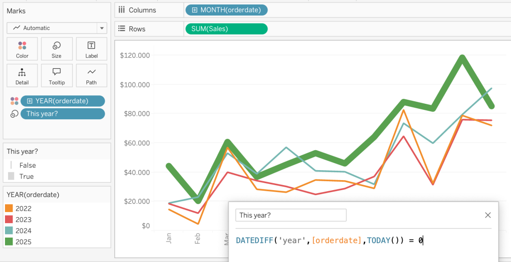
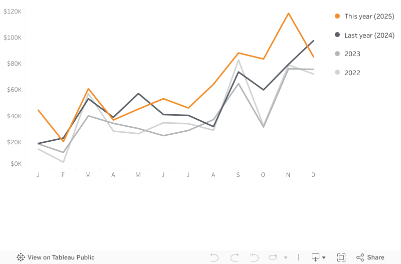
Instead of ‘just’ using a different color per year you can use a different style.: Highlight the current year by using a bold color like orange.
Use grayscale lines for previous years – dark-gray for the most recent year, toned down to light-gray for years longer ago.
And important: when a year has passed, the “new current” year is automatically the new ‘bold’ line.
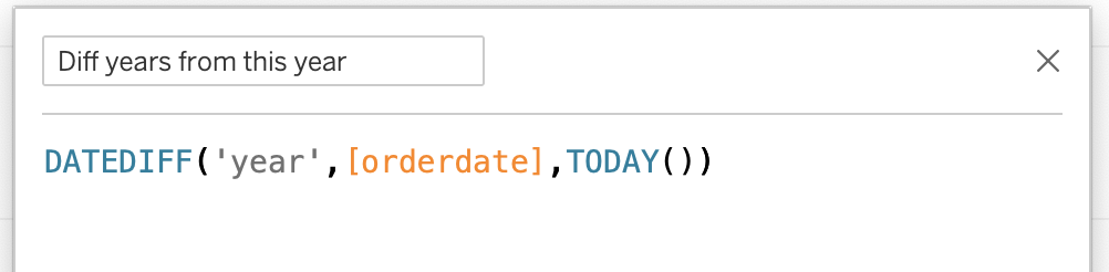
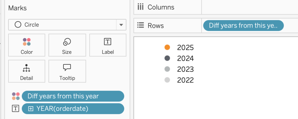
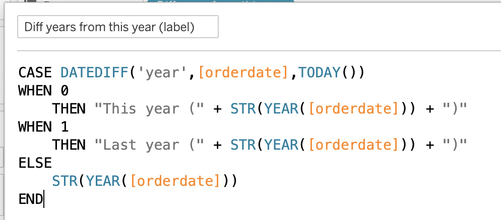
How can we make this work? Easy, with a small calculation which calculates the number of years between this year and every given year:
Put this new calculation on the color shelf, and add the ‘year’ to the label:
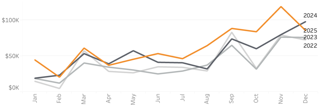
Using this method you can clearly see the most important year – this year – and using the grayscale you immediately get the idea of how long ago the previous years are.
The labels however – don’t work (as they did not in the original version). If the values are close to each other, you can’t immediately identify each year without clicking or using a tooltip. Using the legend of the chart doesn’t help, since this only displays 0 to 3 (or whatever number of years are displayed):
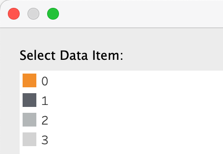
Create a new color legend
This can easily be solved by creating a new color legend using a new sheet. Put the ‘diff years from this year’ on both rows and color, use ‘YEAR(orderdate)’ as label, and use the ‘circle’ as mark (or square, or a custom shape, or whatever you like)
… and while we are at it, we can improve the legend even further. Why not label the current year and last year more explicitly? An extra calculation which is used on the label of the legend makes this possible:
Endresult
Instead of using ‘random’ colors to identify the different years, a more ‘sensible’ approach works so users can more easily identify the separate years in comparison to each other.
(download the workbook and have a look at the calculations!)
Using tooltips and extra elements this can be further improved, but this is a good start on deep-cleaning your linecharts.