• Skip to primary navigation
  • Skip to main content
Antichaos

Antichaos

Tableau, Data Analyse & Visualisatie

  • Home
  • Consultancy
  • Training
  • Blog
  • Showcase
  • About Me
  • Newletter
  • Contact
  • Show Search
Hide Search

Antichaos Blog

Better Titles on Multiple Measure Panes

Johan de Groot · 6 March 2025 ·

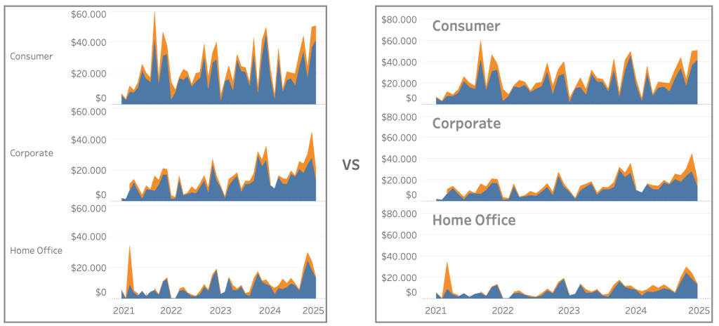
Similar to titles on small multiples, showing title only in the axis on multiple-measure charts is not user friendly. The visuals distance between title and the data is too large, and vertical text is never easy to read:

Let’s look at an easy ways to enhance the labels for better clarity and user experience.

[part of the ‘Datafam London 2024 – Deepcleaning your dashboard’ series]

[Read more…] about Better Titles on Multiple Measure Panes

Netherlands Tableau Usergroup March 2025 @ Nextview Amsterdam

Johan de Groot · 6 March 2025 ·

Tableau User Group Session: Insights, Fun, and Community Spirit!

What happens when you bring together passionate data enthusiasts, a relaxed atmosphere, great food, and a shared love for Tableau? You get an amazing Netherlands Tableau User Group (NLTUG) session on March 4th 2025!

[Read more…] about Netherlands Tableau Usergroup March 2025 @ Nextview Amsterdam

Improve Titles on Small Multiples

Johan de Groot · 27 February 2025 ·

Small multiples charts (also known as trellis charts or panel charts) are a great way to visualize trends across different categories while maintaining consistency. They display multiple variations of the same chart, often sharing a common axis, which allows for easier comparison across groups.

While effective, these charts can suffer from poor readability if titles are not thoughtfully applied. Let’s look at some ways to enhance labels for better clarity and user experience.

[Read more…] about Improve Titles on Small Multiples

Easier date drop-down in Tableau

Johan de Groot · 20 February 2025 ·

This small tip is on how to add a filter to a dashboard with the current month on top, so it is easier to navigate for users.

Not one which will drastically change your dashboard, but a ‘quality of life’ usability tip.

[Read more…] about Easier date drop-down in Tableau

Deep Cleaning: Icons

Johan de Groot · 12 February 2025 ·

Using the right visuals (images) on a dashboard is very important. Icons are often used go guide users into the right direction, so we don’t want to confuse them with unclear images

[part of the ‘Datafam London 2024 – Deepcleaning your dashboard’ series]

[Read more…] about Deep Cleaning: Icons
  • « Go to Previous Page
  • Page 1
  • Page 2
  • Page 3
  • Page 4
  • Page 5
  • Page 6
  • Interim pages omitted …
  • Page 17
  • Go to Next Page »

Antichaos

Copyright © 2025