Sometime you want to make a dramatic statement – and sometimes you just need a little nudge to help users understand a dashboard.
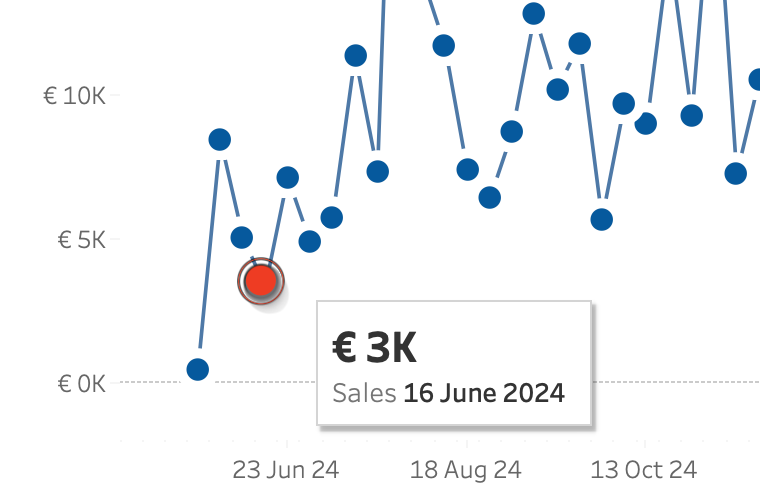
Tableau makes it really easy to create a minimalist dashboard – and tooltips are a great way to unlock the data behind a mark. Emphasizing the datapoint of the tooltip will make the visualization just a little better. And this is even more important on charts with multiple lines.
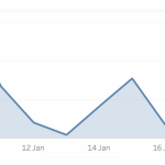
A single line – and focus on the selected mark
When hovering you need to know for sure which mark is selected. That is by default not always clear – especially at a distance. And many users are not used to click on a mark to identify it.
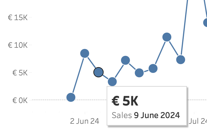
We’re going to change the appearance of a mark when a user hovers over it.
Change the mark on hover
To make this subtle change you need to take quite some steps – but none of them are difficult. The linechart needs to be build using a dual axis with a synchronized line and a shape axis, as described in this previous blogpost.
Then:
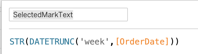
1. Create a String parameter called ‘[SelectedMark]’
2. Create a calculated field called ‘[SelectedMarkText]’, which contains a string (pure text) version of the date. My chart is per week, so I use this calculation:
3. Create a second calculated field which checks if the value of the previous calculation is equal to the value of. the ‘[SelectedMark]’ parameter
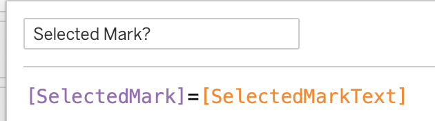
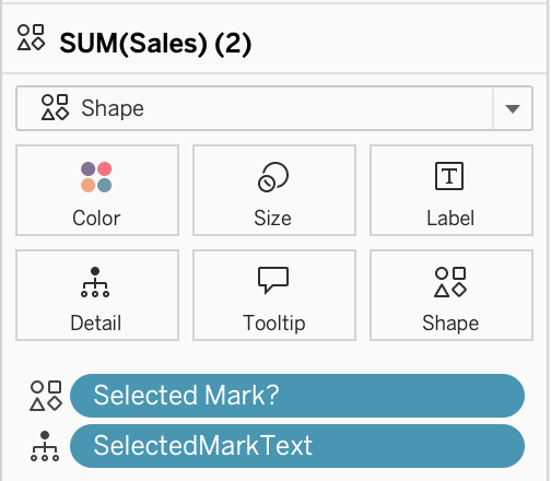
4. Drag [SelectedMarkText] to Detail, and [Selected Mark?] to Shape.
The first calculation is needed to fill the parameter with the marks-value when the mouse is on the mark. The second one will change the shape of the mark.
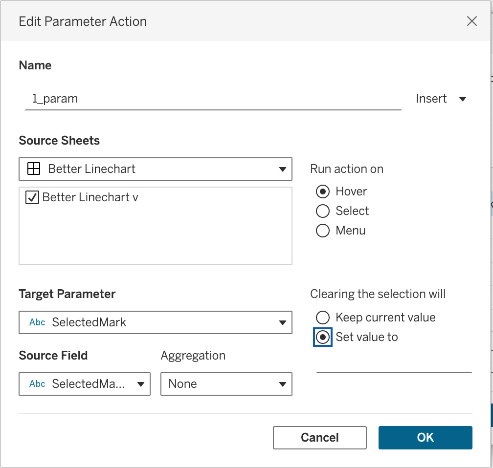
Make sure the sheet is on a dashboard, and open the Dashboard Actions (menu: Dashboard > Actions), and select ‘Add Action’ > ‘Change Parameter’. A dialog box show up.
First give the actions a sensible name (…), then choose ‘SelectedMark’ as the Target Parameter, and ‘SelectedMarkText’ as the Source Field.
Set ‘Run action on’ to ‘Hover’, and change ‘Clearing the selection will’ to ‘Set value to’ – and leave this value empty.
How this works
- Whenever you hover on a mark, the parameter ‘SelectedMark’ will be set to the value of ‘SelectedMarkText’ (the ‘Source Field’ in the dialog).
- When you remove the mouse from the mark, the value of the parameter is emptied (“Set value to” = empty)
- Because the value of the parameter and the calculation are the same whenever you hover on a mark, the value of [Selected Mark?] changes from False to True
- The shape of the mark will now change because the selected (‘hovered on’) mark value of [Selected Mark?] is now True, while all the other shapes are still False.
Choose the shapes for False and True just the way you want to. I used the dot with extra white-space from “Better Line-charts” as my default shape, and a more pronounced shape as my ‘selected’ shape. If you put the [Selected Mark?] field also on Size you can differentiate the selected mark even more from the rest!
In action
When implemented in Tableau Desktop it really looks nice – the selected marks really attract more attention:
Unfortunately on Tableau Public it isn’t such a smooth experience, since the change of the shape takes some time. When published to Tableau Cloud it looks/seems like the experience is better, but I have to test this.
You can test the Marks change on hover yourself on Tableau (and download the workbook and test it yourself!)

My enthusiasm on the implementation went down a bit because of the performance, but I still think this can be a very good addition to a dashboard.
This solution is definitely not intended to be used on every dashboard and sheet, but there are many use cases the extra attention on the selected mark is useful, like on meetings and presentations, where every avoided point of confusion is a win.