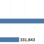
Recently I ran into a small but surprisingly tricky problem: how do you visualize something that’s in progress? A standard bar chart works usually perfectly for completed values, but what about the final bar isn’t finished yet because e.g. the year isn’t finished yet,
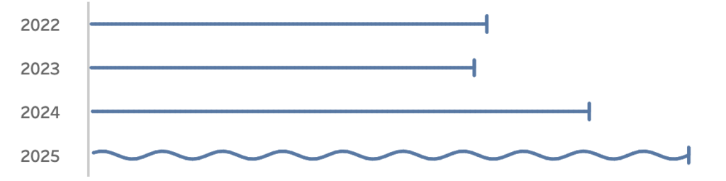
Fading it out, changing the shape or adding a label like “in progress” didn’t feel right. I wanted something that instantly communicates “this is still ongoing”.
Inspired by how Spotify shows an ongoing song I started experimenting with using a sine wave to bring that bar alive. Instead of a static column, the last bar gently oscillates – hinting that it’s active, not finished.
In this post, I’ll walk through how to create this effect in Tableau step by step.
If you don’t need an ‘in progress’ viz, you can always use it for something else….

Breaking it down
What do we need to make this work?
- If I want to draw a sine wave I need to add datapoints – just like other solutions like the funnel and fancy bezier curves. By multiplying each datapoint a line can be drawn from one point to another via any path
- Instead of only an X value for a bar-chart both X and Y needs to be calculated: X for every step to the right, Y to show the sinewave.
Data Prep: Scaffold Data
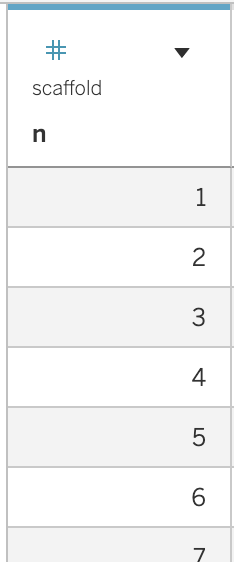
I use the well known SuperStore dataset for this example.
To create the sine wave I need to add extra datapoints. This is easy by creating a text-file with just the number 1 to 100. In a database it is even more easy by using the database function. Using DuckDB the custom query SELECT range AS n FROM range(1, 100)
returns exactly what I need. About every database has its own SQL dialect to make this work, but you can also just create a table with these numbers.
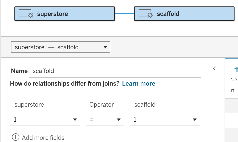
The relationship between the scaffold-table (1-100) and the superstore is as simple as it gets: choose ‘edit calculation’ in both parts of the relationship, and add a 1 (‘1’) in the field. This relation will multiply every datapoint 100 times – just what we need to create a fancy sine wave from a single value.
Two calculations: X and Y
The 100 marks I am using are divided into two parts: the sine wave uses 97 of them, the vertical line three: 98 to align the sine wave with the line, 99 for the top and 100 for the last mark.
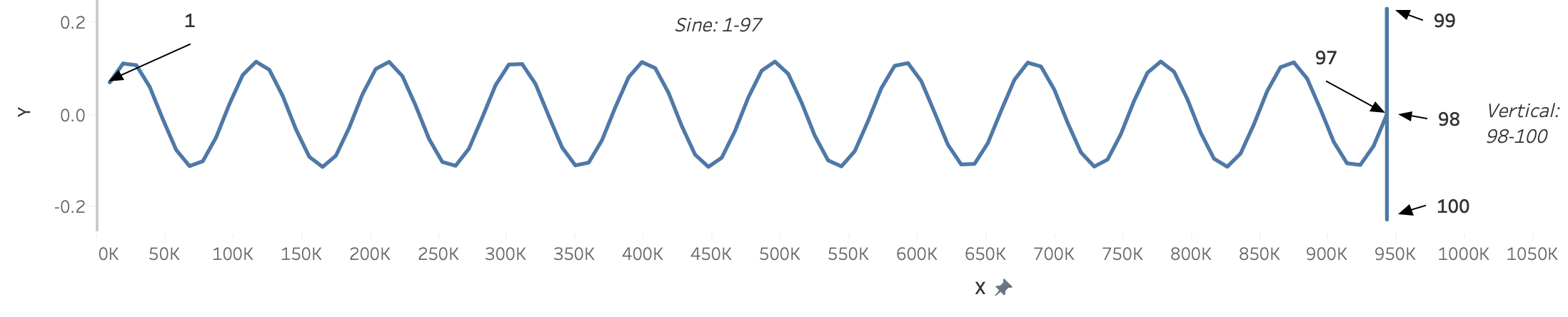
Calculation X
The calculation for X (horizontal) is quite simple: 1/97 of the value for every step, and the last three are on the same position:
IF MIN(n) <= 97 THEN
     SUM([Sales])/97 * MIN([n])
ELSEIF MIN([n]) <= 100 THEN
SUM([Sales])
END
Calculation Y
The vertical calculation – Y – is a bit more complicated.
I want only the last bar to be a sine wave, so I use the ‘LAST’ table calculation to differentiate between them. The last row (the ‘unfinished’ bar) contains the sine wave, all previous rows show a horizontal line. The ‘logic’ is based on the values 1-100 from n, the sine itself isn’t very difficult:
IF LAST() == 0 THEN
// --- Sine + vertical line ---
   IF MIN([n]) <= 97 THEN
   // Sine section
      ([Height] / 2) * SIN(RADIANS( (MIN([n]) / 97) * [Sines]* 360 )
)
ELSE
    // Vertical line (twice the sine amplitude)
    [Height] *
    ( CASE MIN([n])
        WHEN 98 THEN 0
        WHEN 99 THEN 1
        WHEN 100 THEN -1
      END )
END

ELSE
// --- Flat reference line + vertical line ---
[Height] *
(
   CASE MIN([n])
   WHEN 98 THEN 0
   WHEN 99 THEN 1
   WHEN 100 THEN -1
   ELSE 0
   END )
END
The visualization
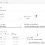
When typed out these calculations, it is easy to create the worksheet. Drag X on the Columns, and the OrderDate and Y to the Rows. Change the Marktype to ‘Line’, and drag ‘n’ to the Path shelf:
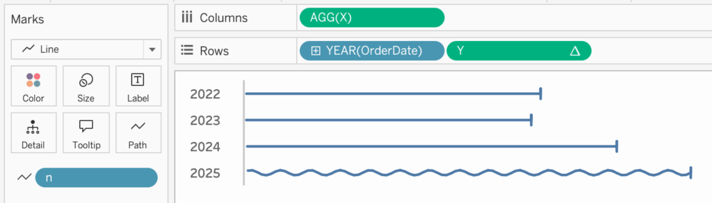
The very last step is setting the ‘Y’ Table Calculation to ‘Table – Down‘

Live visualization
The interactive chart looks like this – I added the ‘height’ and ‘number of sine waves’ option so you can see how these change the visualization”

Concluding
A sine wave isn’t just a smooth curve — it’s a reminder that data moves, evolves, and repeats. Visualizing it this way turns numbers into rhythm and insight into motion – and sometimes, it’s simply a nice way to bring a chart to life or add a little fun to your dashboard.